i’m going to be doing some testing on our addthis sharing menu. before we actually go through with some of the tests, i’d like to get your opinion first:
a) which one is the prettiest and blends in with my webpage.
b) which one looks like you can click on it.
c) which one is easiest to read.
here are your choices. please help me by voting! just post a comment! ^__^
1. gray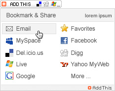
2. google blue underline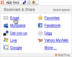
3. google blue bold underline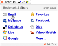
4. blue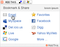
5. blue bold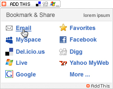
a) 1 (my fav)
b) 1
C) 5
I’m torn between 1 and 5.
a) 1.
b) 2.
c) 5. (my favorite)
rawk.
awesome! thanks for the feedback. this really helps me out. this seems like a success. i’ll probably start blogging more polls to get more design opinions.
you guys rawk!!
a) 1
b) depends. if you’re asking with the mouse scrolled over “email,” they all appear as if you can click on them. if you’re just looking at it with the menu scrolled down, the ones with the underline (2 and 3) look like you can click on them.
c) 5
overall, i like number 1 the best.
Overall, I would just go with 5. its the best balance of legibilty and attractiveness.
A) 1 (It’s on my blog)
B) I like 1, but are what are the metrics (i.e. put the #1 shared site as the lead.
C) I like the grey. It let’s the colored icons stick out and not compete with a bold color.
-marty
a) 1
b) all. 2 & 3 are perhaps the most obviously linked (in the old school, "look at me i'm brightly colored & underlined sort of way), but i'd never vote that you adopt them for any purpose. too busy!
c) 1
i like 1