 Has anyone else noticed that YouTube has been doing a lot of testing, and rolling out incremental design updates? I’ve seen small changes here and there, but last night I saw their latest design. It’s much cleaner, and puts the content first, versus all their other social features (like sharing, embedding, favoriting, and comments). Has anyone documented how YouTube has iterated with their design?
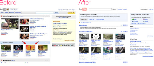
Dashboard
Ah yes, they changed their main navigation and put the search input next to the logo. They’ve done a substantial amount of subtraction to features as well. For example, notice how they removed the star ratings, and removed the header backgrounds. Lastly, they’ve been incorporating more social features and added an “inbox” on the right. I just wonder exactly what they have in mind for the future…
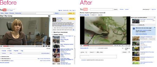
Content Page
The first thing I noticed is that they moved their embed feature below the content. This moves the recommended content up, which is smart. Get someone watching a video, and then get them to watch more immediately. They’ve even added an “autoplay” which keeps videos streaming. Smart move.
What have you been researching!!
not really researching. just something that i've noticed. it's a substantial change!