Xbox just released a new form factor, which pimps a smaller footprint and is coined “slim” as part of its product marketing. I’m not sure if “slim” is the correct adjective to describe it. I thought they could have played off the 360 name… maybe Xbox 720? Anyway, it’s got a load of new features, but I want to show the evolution of the exterior body design.
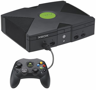 Original XBox
The original Xbox was a tank. It was huge, heavy, and larger than all the other platforms. I detest how they used the ribs on the side to look like a heat sink—it trapped so much dust and crap.
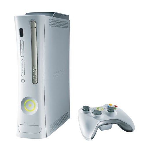 Xbox 360
This was a beautiful and distinct design. It’s interesting how the curved shape of the xbox was reflected in their original dashboard interface. The design of the box enabled it to be stood like a tower or flat like a dvd player. Overall, the design was much cleaner, distinct and visually pleasing.
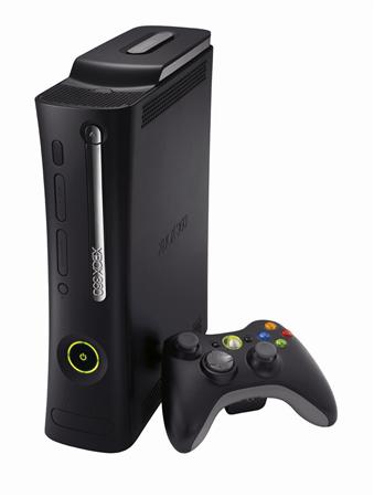 Xbox 360 Elite
As far as form factor goes, it was the same as the Xbox360. The only difference is that it had a black finish and a chrome dvd drive.
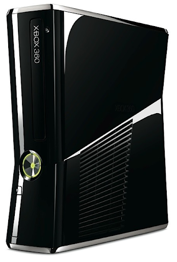 Xbox 360 Slim
This is the newest Xbox 360 design, which is smaller and has a more geometric shape (versus the previous organic curvy shape). All the lines converge to the power button, and the gloss black finish gives it a very high-tech gaming machine feel. It reminds me of the Alien Ware desktops—These are computers designed for hard core gamers. I’m sure if I agree with all angles and lines. Personally, I would have preferred if they went a more minimalist rout, and made it look more like a slick super computer server.
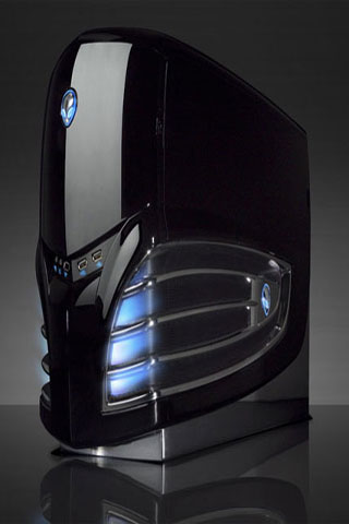 Alien Ware Desktop
This is an example of an Alien Ware desktop computer. As you can see, the new Xbox 360 uses some of the same visual language such as gloss black and lines that resemble gills. Both designs also imply that they should be stood vertically.
the xbox 360 was intended to look like the shape of your lungs when excited