“Ever wonder just how segregated your city is? Photographer Eric Fischer might have an answer. Inspired by cartographer Bill Rankin’s recent maps charting Chicago’s racial segregation, Fischer decided to make a few maps of his own. The maps, which include dozens of cities, show just how enduring racial stratification continues to be in this country.” – colorlines.com
While some people are really surprised, I’m not. I guess being a minority in the US gives me a different perspective. According to wikipedia, 75% of the US is white, 15.4% is hispanic/latino, 12.4% black, and 4.4% asian. Hat tip: Charlie
Red = White | Blue = Black | Green = Asian | Orange = Latin
Left: Detroit, Right: Chicago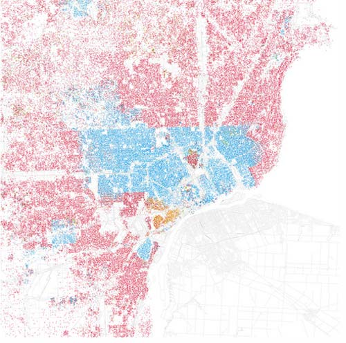
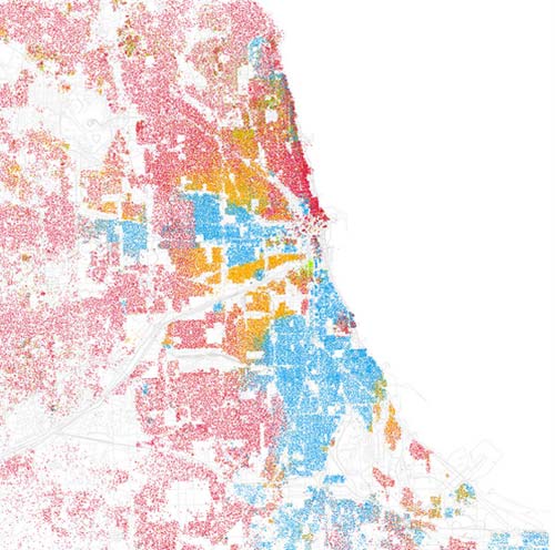
See more cities on the photographer’s flickr page.
Chicago doesn't really segregate…as a Filipino guy all I can tell you is that the Asians segregate themselves…all the new immigrants end up moving into suburbs with a lot of Asians and try to fit in with the locals and the kids get beat up for acting like theyre from the hood lol
i've noticed that segregation is proportional to population density. asians have to stick together. 😉
Uhh, I think your math is off on the percentages.