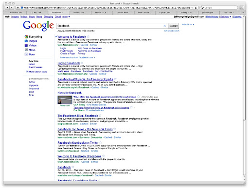
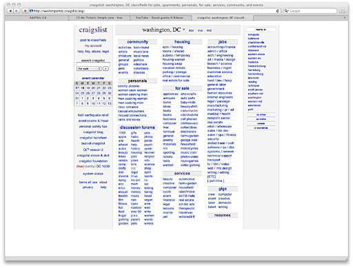
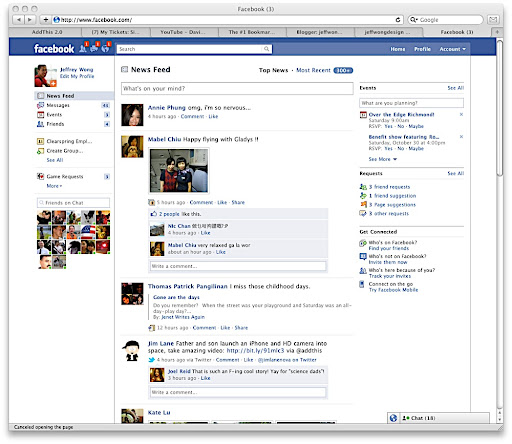
There are a ton of new sites with that glossy 2.0 look. Big buttons, sexy styling, jquery, etc… but there’s something about the old 1.0 look—you know, blue links. The 1.0 look isn’t appropriate for everything, but it seems to be a common theme between sites that act more like utilities. For example, when you look at Google, Wikipedia, Craigslist, Reddit, or even Facebook, you don’t think it was designed by anyone. You just think that it’s the way the web works. There’s something really appealing about it… it’s fast, it’s simple, and there’s hardly an interaction learning curve. What do you think?