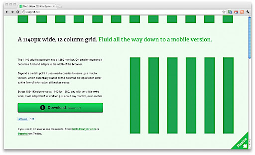
The 1140 grid fits perfectly into a 1280 monitor. On smaller monitors it becomes fluid and adapts to the width of the browser. Beyond a certain point it uses media queries to serve up a mobile version, which essentially stacks all the columns on top of each other so the flow of information still makes sense. Scrap 1024! Design once at 1140 for 1280, and with very little extra work, it will adapt itself to work on just about any monitor, even mobile.
I’ve been using 960gs with Foo for a while now… but I’m definitely going to try this new grid system. I’d like to see some examples of sites that use this system. Check out cssgrid.net to learn more and download the spec.