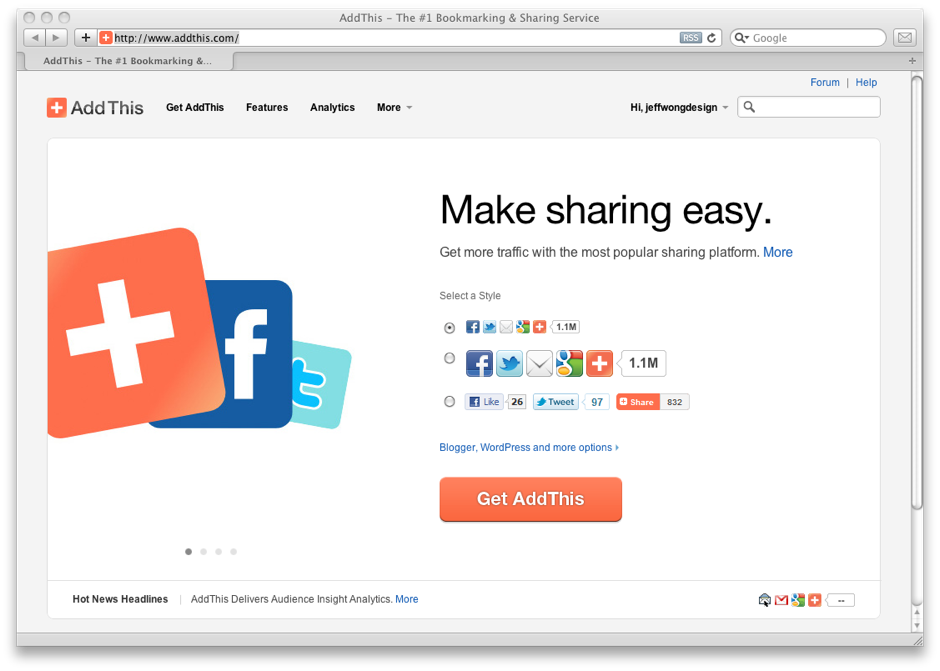
We recently updated the AddThis homepage. The focus was to simplify the page without losing functionality and features. Ultimately, the metric of success was to make it easier for publishers to grab the code and increase conversions. As you can see, the homepage is as simple and focused as it can be. And based off our AB test, this was the winner.

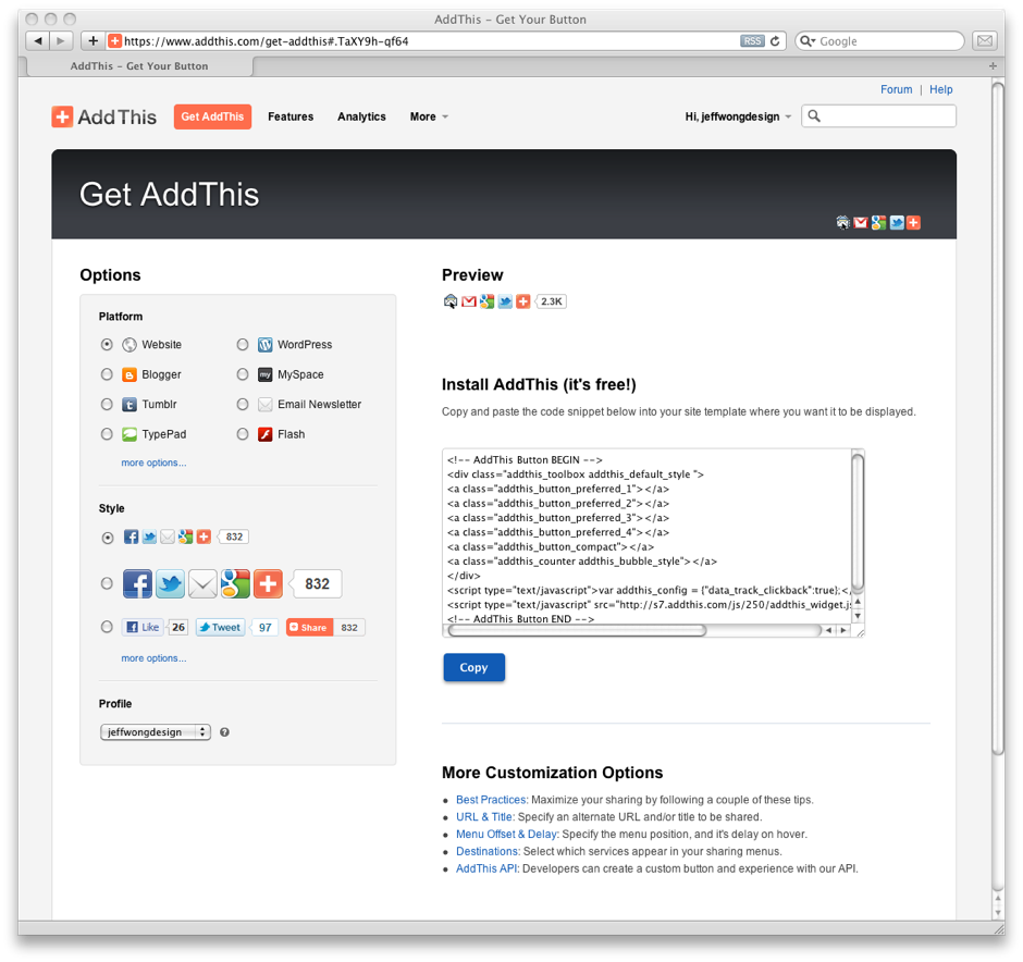
In addition, we’ve updated our Get AddThis page. Before, it was a multi-step process. To accommodate new features and make it easier to toggle options, we went with a WYSIWYG model. We explored several ways to get the code, and this seemed to be the most straightforward and user friendly.
Huge kudos to our team who pulled the dev and testing together for this. These are arguably the most important front facing pages of our product, since they’re at the top of the funnel. I look forward to sharing the results of our next tests.
w00t!
thumbs up. 🙂