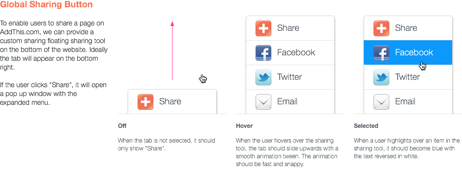
As we relaunched the site, I designed sharing tool independent of the page. Huge kudos to Foo for making it a reality. It’s cool to see new sharing tools come to life. If you’d like to get your own, grab it from AddThis Labs.
AddThis Wallpaper
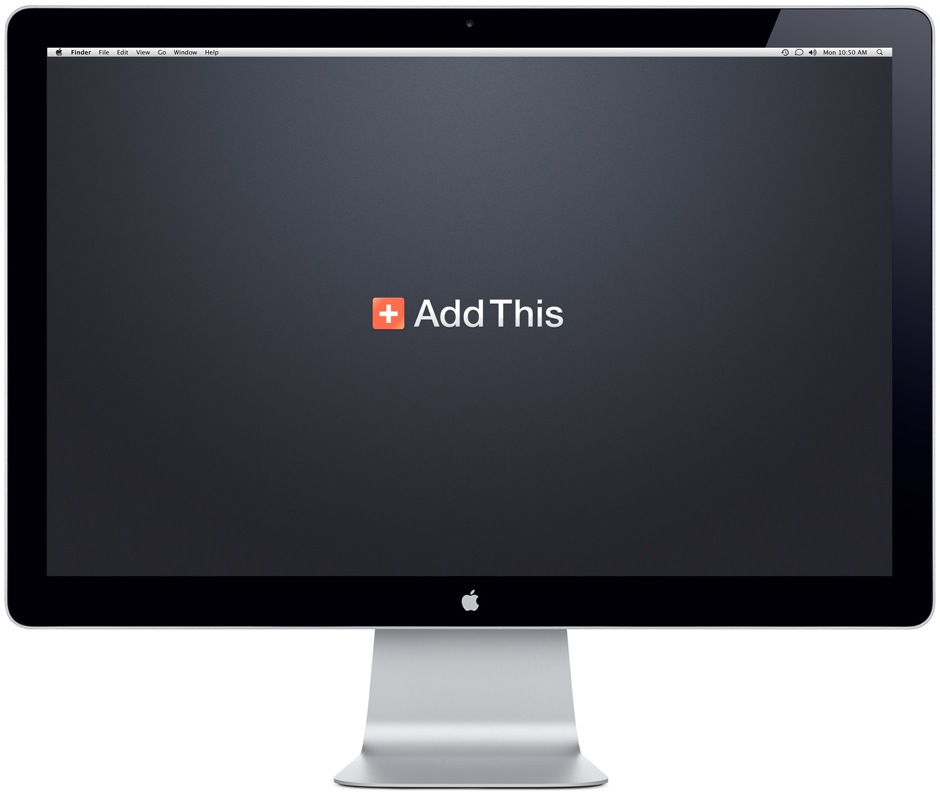
I was asked to create a desktop background for AddThis recently. As luck would have it, I had an old wallpaper I created a while ago. Here’s a 1920×1200 image. Click to download.
Floating Vertical Buttons
Here’s a video I created to showcase the floating vertical buttons in a blog post. Originally, I created a couple of images, but they didn’t seem to tell the story of how simple it is to add to your a site.
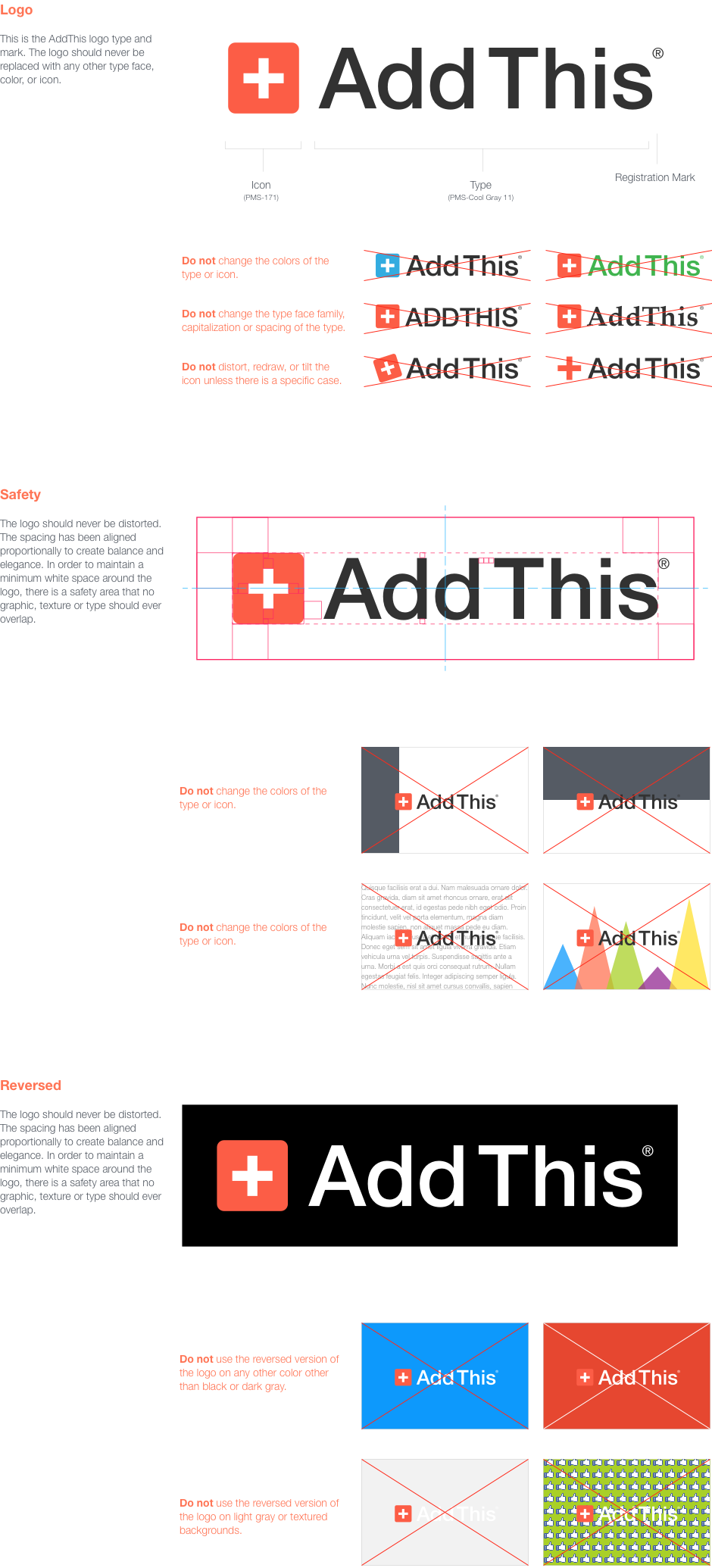
AddThis Logo Standards
AddThis is a difficult logo to work with at times. The plus icon is generic, and can be mistaken for “swiss army”, “red cross” or the “swiss flag”. That’s why it’s important to use it in the right context.
The most important part of our logo is the color and proportion of the plus. If either of these attributes change, it no longer feels like “AddThis”.
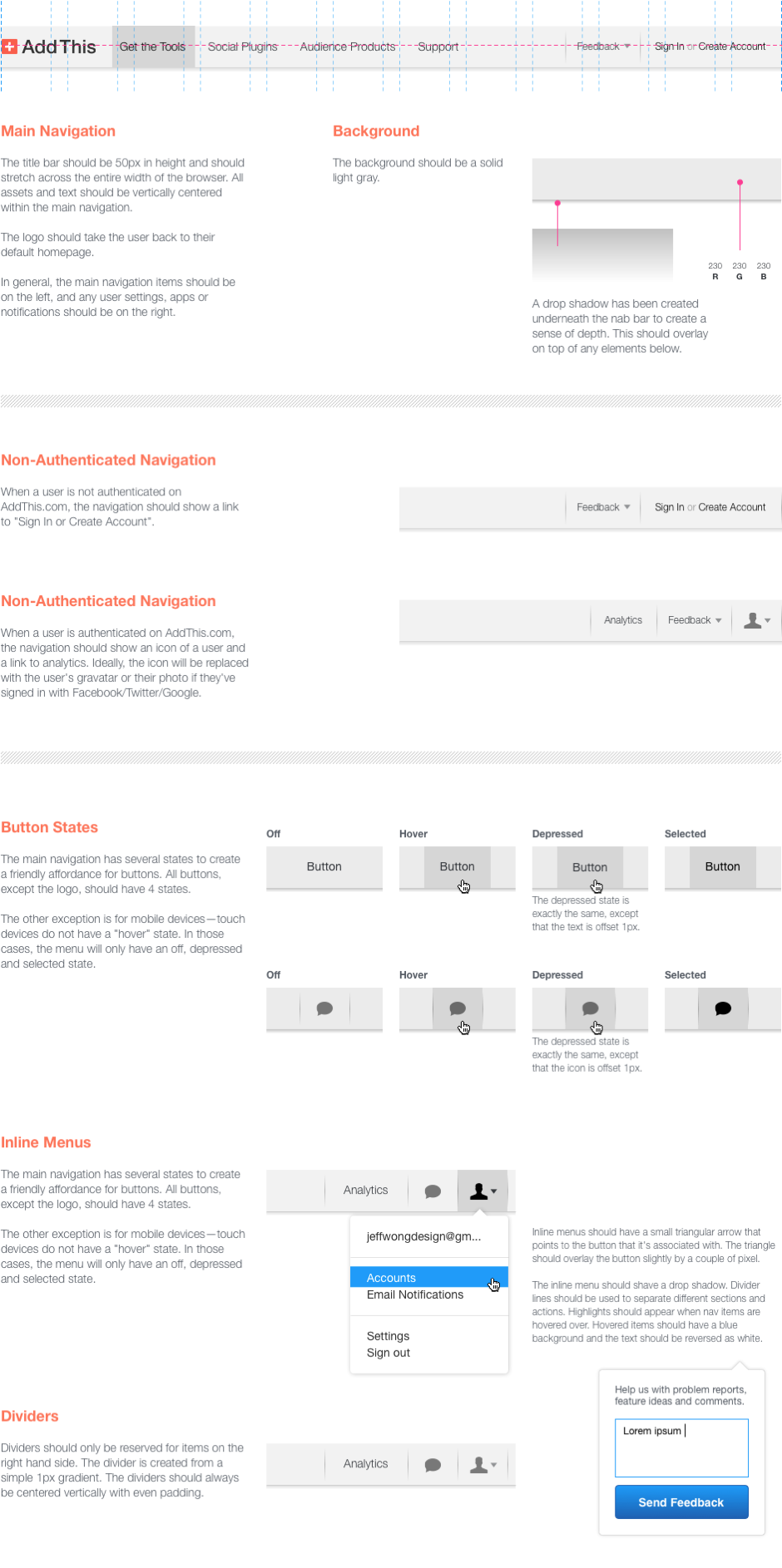
New AddThis Navigation
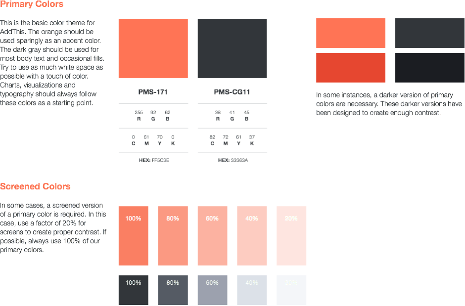
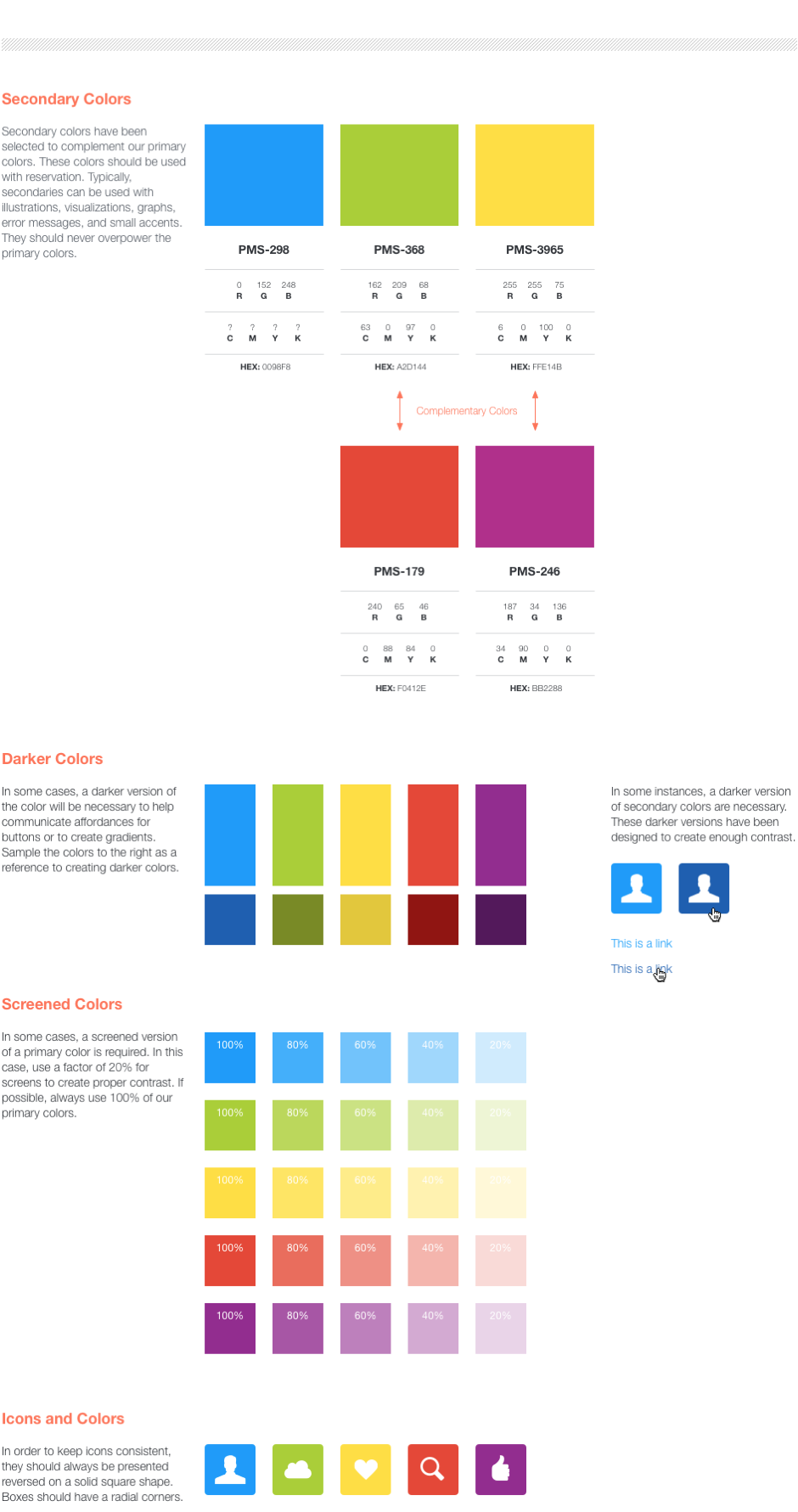
AddThis Brand Colors
Here are some specs for the colors I selected for AddThis. The trickiest part of picking a color is trying to make it work across multiple mediums (print, computer screens, paint, etc).
