Baking Purpose into Culture

Over the years, the brands that I adore the most have been built by the most determined people in the world with a vision—but something deeper drives them.

Purpose.

It is the gravity that pulls people from around the world to be a part of their story. Purpose is the north star that guides them. It reminds every employee to protect something much more precious. When they get up in the morning, they have a clear idea of what they’re fighting for.

As I work on early stage companies, I realize that product market fit and growth are critical, but those metrics represent a small fraction of the company genome. Companies go through ups and downs searching for product market fit—hell, after finding product market fit, they have to find product economic fit. It’s easy to lose footing when everything’s constantly changing. Hopefully a purpose can be the inner fire that reinvigorates a team and enriches their lives.

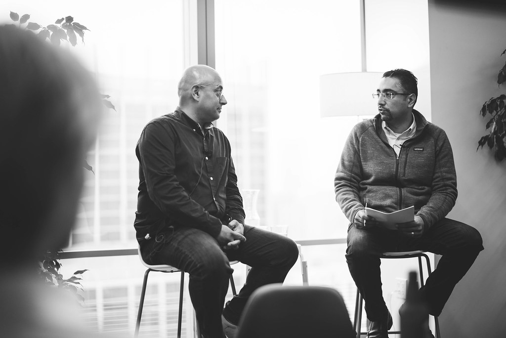
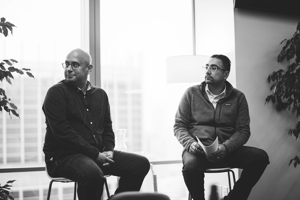
I’ve seen how teams can fall apart quickly—motivation can literally evaporate before your eyes–people start showing up later, and daily interactions become mercurial. I’m embarrassed to admit that one of my teams fractured from misalignment in one point in my career. I focused too much energy on building vision. In hindsight, I should have spend more time with my co-founders to un-package the most fundamental question, “why?”

Why are we building this product and why the does it matter?

Our purpose wasn’t baked into our DNA from the get-go, and the effects were clear when the chips were down. All is not to say that we wouldn’t have failed. Even if we had a crystal clear purpose, we could have inevitably perished… but at least if we were going to fall on the sword, everyone would know why it was worth it.

Aram shared this advice with me recently, “99% of the projects out there are not worth doing, but 1% is worth dying for.” As we get older, we have less time to start new things, and we have to be more deliberate about how we spend each day of our life. I think purpose can help us decide what that 1% is.

I believe there’s an opportunity to bake purpose early into a company culture and get teams to move mountains. That source of inspiration must be authentic and ultimately human. It has to be a feeling that touches their soul and reconnects everyone with the world they’re fighting for.

Hat tip to Sina and Expa for opening my eyes to this.

Expa Fireside Chat with Vishal Vasishth (Obvious Ventures, and former Exec at Patagonia)

Expa hosted a fireside chat with Vishal Vasishth, who was once part of Patagonia’s team. If you know Patagonia as a company, they were founded on the core belief of doing the right thing for the world, the people, the environment and their employees. Their purpose goes beyond making money–but rather, to preserve our planet, our resources, and empower fellow human beings.

Vishal echoed some of the culture from Patagonia–you can tell that the company deeply enriched him during his tenure there. If you want the dive deeper into the source code, check out “Let My People Go Surfing”. Yvon Chouinard (the co-founder of Patagonia) was the original activist and war poet that fought for corporate social responsibility and ethics.

I left all my notes at the office, but I wanted to share some thoughts while they were still fresh in my head. One quote that really stood out was, “A company can be a gift to the world”. This struck me because most companies are perceived as extracting value out of their customers and employees. How can a company be a catalyst to give back to the world more than it’s taken?

Vishal said he was moved by companies that he believed could be here in a hundred years, serving a global purpose. He gravitated towards founders and companies that focused on themes around sustainability of resources, health, or empowering people to do things.

As we build our own culture, I reflect on our own opportunities–to find purpose beyond financial opportunity. Vishal asked, “Is there a way to inspire your 1,000th employee with the same passion of the team when it was only 10?” There’s a saying, “99% of work isn’t worth doing, but 1% is worth dying for”. I don’t think anyone has to fall on the sword for our vision, but we should always have a north start that pulls us together to achieve something bigger, together.

The vision of empowering everyone in a company to have a voice and involving everyone in the decision making process is what moves me, personally. I’m hoping Input can help teams do their best work soon.

Anyway, it was fun hanging out with everyone at the event. If you’re in town, you should definitely attend one of these. In the mean time, here are some more photos:

Oh yeh, there was some yummy food and wine there! ^_^

Human Centered Design with Sina Mossayeb (Expa, formerly IDEO)

DSC_7891

AirBnb created unscalable prototypes (like take brighter photos) to grow.

I attended a masterclass with Sina this afternoon. It was pretty fun, and it was a great reminder of why it’s important to stay close to our users. I’ve always been a fan of IDEO and have been moved by their work ever since I was in college. Here’s an old post I did about The Art of Innovation–it echoes the same concepts that Sina shared today.

DSC_7897

By spending more time with our users and asking them questions around their work flow, we can understand their problems. They spend time actually in the homes of their customers, diving deep into the heart of the problems first (versus start with a solution and making assumptions).

DSC_7899

The different groups sharing ideas and concepts.

One of the greatest take-aways is that creativity and innovation is not an efficient process. If you want efficiency, it’s best to go out and copy what’s already out there. If you want innovation, it’s an involved process and requires time to discover.

DSC_7896

The classic IDEO rules of brainstorming.

IDEO has made a business around user centric design and innovation. They’ve helped some of the largest companies solve the most difficult problems. Sina went through a ton of examples—too many for me to list. If you have time, you should reach out to him and get a copy of his preso.

DSC_7893

One of the early exercises to break the ice–draw the person to your right.

We spent time going through an exercise, exploring how to innovate around a toothbrush and oral hygiene. We posted as many problem areas as possible, and then followed up with potential solutions. Then we voted on the one that we wanted to explore.

DSC_7895

Sticky notes with small illustrations, large legible type, drawn with permanent marker.

My group designed a Roomba for your mouth. We prototyped something that looked like a mouth guard out of playdoh. The opportunity and problem we wanted to solve was freeing up your hands and letting you multi-task. Brushing your teeth requires 3-6 minutes each time, so why not automate it?

DSC_7900

A couple of small prototypes with drawings.

The next step in the design process would be to take the prototype to people and start getting feedback quickly, and iterate. Each time diving deeper into the problem we’re solving.

DSC_7901

It was a great session—more importantly, it’s a reminder to stay closer to our users. As we launch our product, we need to walk in the shoes of people who use the product first and be human-centric.

Lastly, I wanted to share a couple of my favorite quotes from the session:

  • “Prototypes are sacrificial concepts. Build to learn.”
  • “People are not binary. What people say, think and feel is always contradictory.”
  • “Immerse yourself and become the person you are designing for. Go to their homes, to their workplace and where it matters. Take a look at their family album. Deep dive to find the problems.”
  • “The more creative you are, the more process and structure you need to put around it.”
  • “It’s not about listening to the expert, it’s about knowing the humans.”

I wanted to thank the Expa team for coordinating the event. This is the foundation of design, and it’s why I started in the first place. It’s too easy to get caught up with metrics, backlogs, etc. I need to go outside, get out of the pixels, and actually live with the users.

Weekend Design Session with James and Juan

DSC 6983

Jamming with James and Juan at Expa.

It was cool jamming with these guys this afternoon. Their passion for design is just infectious, and I feel I’m learning a tremendous amount from this group.

DSC 6984

Setting up all the fonts now so I don’t have to do it again later.

As much as I want to jump ahead and design new features on Input, I actually have to take a step back and clean up our sketch files and really look at the entire system. Since we’re redesigning everything, I’m taking the time to set up everything—the fonts, the spacing, the symbols, and the asset naming. The future is looking brighter.

DSC 6985

Juan doing some amazing illustrations.

I’m hoping I can keep the system as simple as possible. It’ll evolve over time, but I’d like to stick to a foundation that we can build on top of for the years to come.

By the way, I’m really looking forward to reading this tomorrow:
Design Systems Handbook

And I’m currently watching a YouTube video of John Vino designing live. It’s pretty cool to watch his process.
Live UX Design with John Vino

The Difference of a Few Pixels at Facebook

1 wVbXLamvms92BPrapEBigw

Comments refinements on Facebook before (L) and after (R).

Vitor shared an article with me recently about how FB did a ton of testing and research to arrive at their latest design iteration. It’s pretty amazing how dozens of small refinements working together can make a huge difference.

Small changes, like a few extra pixels of padding or the tint of a button, can have large and unexpected repercussions.

On a side note, it looks like Facebook has integrated a ton of design cues from Instagram—rounded corners, chat-like comment bubbles, outlined icons, and overall a lighter interface.

Inspired by Facebook

I’m currently working on a comments feature as well on my project and I’m going to borrow some design cues from our friends at FB.

New

Revised version of comments, following a similar style as FB

I think that the icon shape, bubbles, and avatar sizes creates a better visual hierarchy. I’m pretty sure I’m going to change it again in the future, but this looks like a nice improvement. Anyway, we have some good stuff coming soon. Really looking forward to shipping this new design.

Evolving the Facebook News Feed to Serve You Better
Hat tip: Vitor

Beautiful Pills by Takecareof.com

Screen Shot 2018 02 13 at 10 04 18 PM

Takecareof.com (Hat tip: Erin)

I’m really digging this site. The photography, the typeface, product packaging and the aesthetics are 👌. The product itself seems pretty cool—personalized vitamins. It even says “Hi [your name]” to give it that personal touch.

Typeface

Let’s start with the font… I really like the combination of bold san serif for the headers, and serif for the body. The combination of short punchy headlines make it feel kind of handmade and human.

DLR GRP 2359

Ginger

It kind of reminds me of a modern day Futura, but more refined.

125733

Gauthier

Love this font as well. I’d could imagine using this for a print project… something with debossed type on a nice thick stock. It just has such a tactile feel to it.

Photography

I have nothing but good things to say about the photography. I absolutely love the pictures of ingredients on a solid color background. The neutral pastel colors combined with the strong accent colors of the ingredients are absolutely tasty.

Img prenatal hero

Img turmeric hero

Img vitaminc hero

And when you combine type on top of these images, it just looks 🤘. I’m guessing that they did a bunch of photo composites… but it looks good.

White Space

And their use of white space is pretty boss. It’s like a breath of fresh air when you scroll through their site.

Screenshot

Anyway, I thought this was a good one to bookmark. They made a bunch of pills sexy, approachable and human. 💊

Takecareof.com