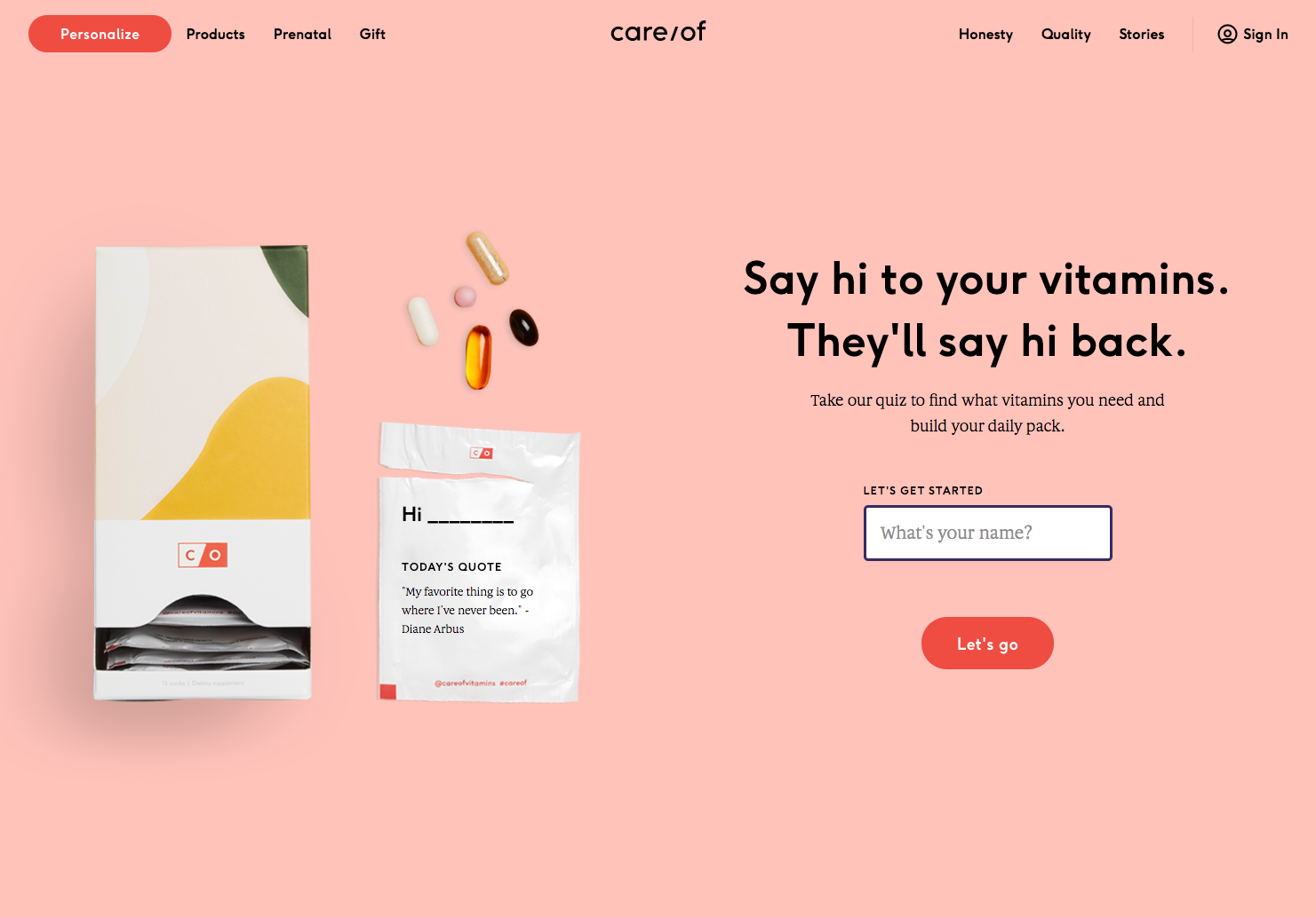
Takecareof.com (Hat tip: Erin)
I’m really digging this site. The photography, the typeface, product packaging and the aesthetics are 👌. The product itself seems pretty cool—personalized vitamins. It even says “Hi [your name]” to give it that personal touch.
Typeface
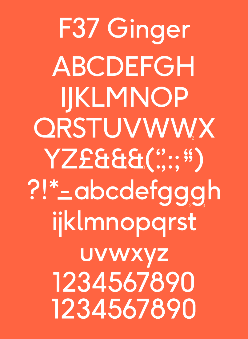
Let’s start with the font… I really like the combination of bold san serif for the headers, and serif for the body. The combination of short punchy headlines make it feel kind of handmade and human.
It kind of reminds me of a modern day Futura, but more refined.
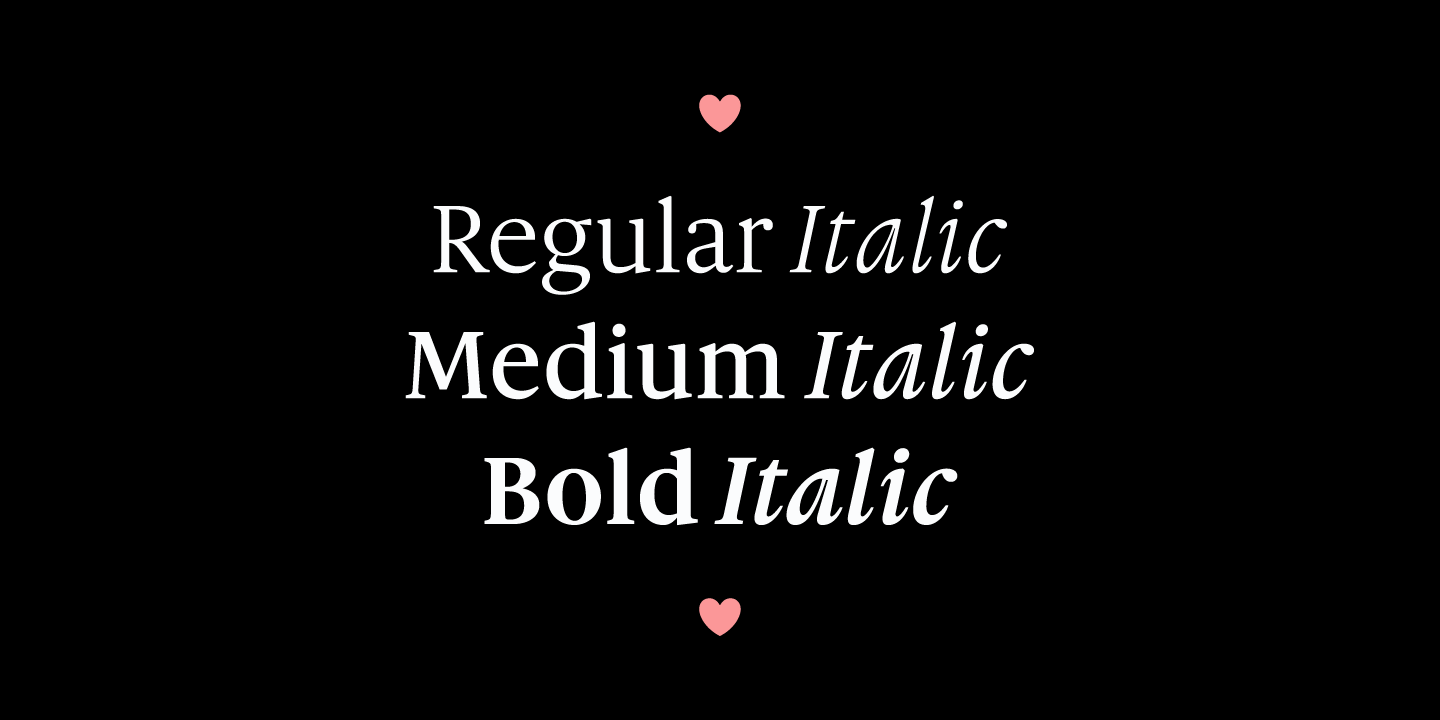
Love this font as well. I’d could imagine using this for a print project… something with debossed type on a nice thick stock. It just has such a tactile feel to it.
Photography
I have nothing but good things to say about the photography. I absolutely love the pictures of ingredients on a solid color background. The neutral pastel colors combined with the strong accent colors of the ingredients are absolutely tasty.
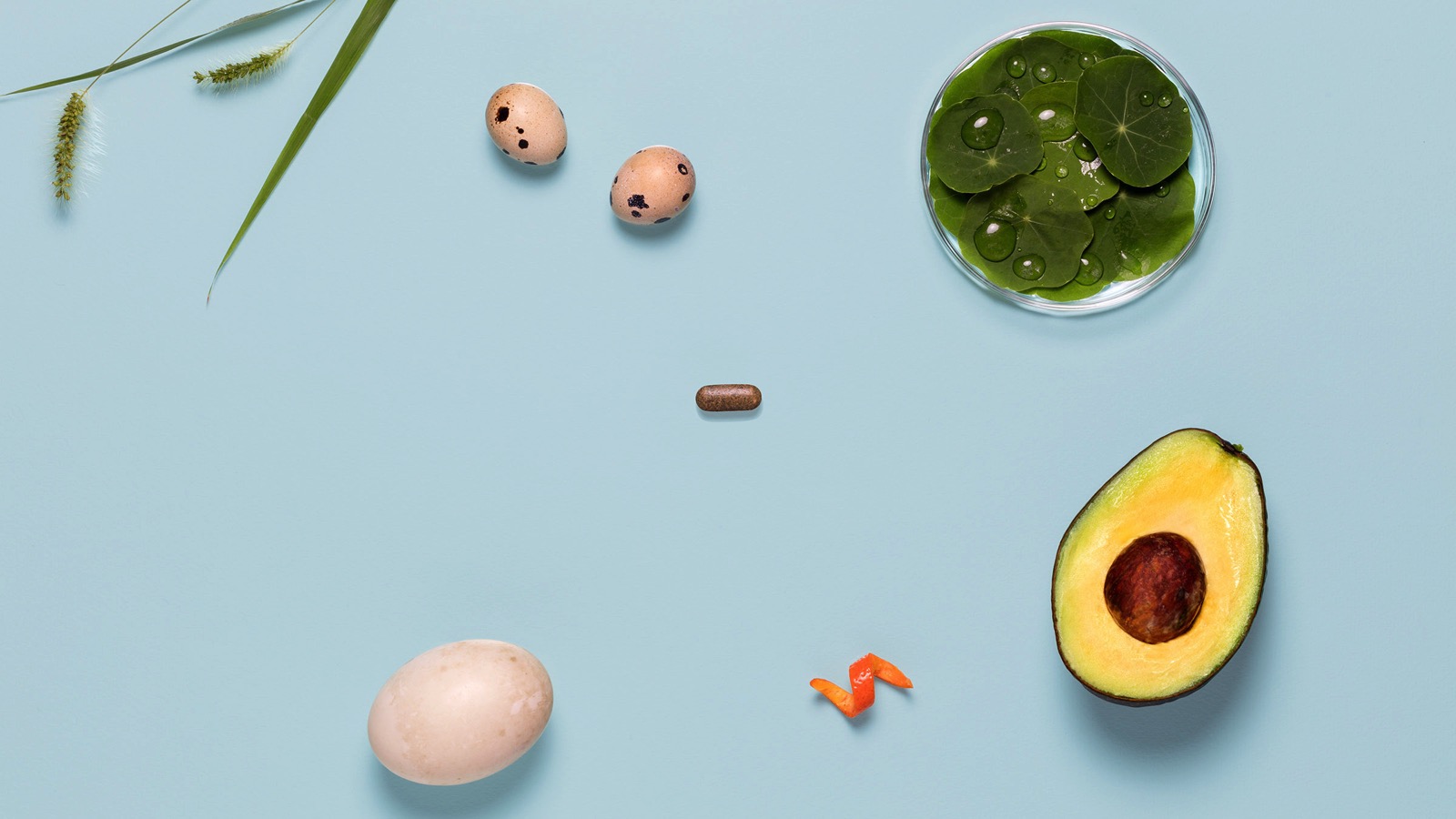
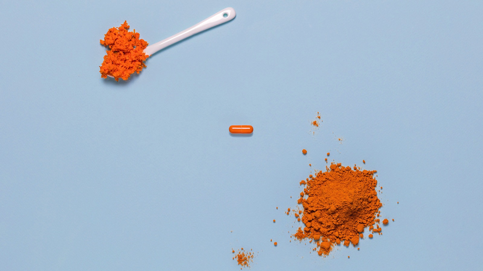
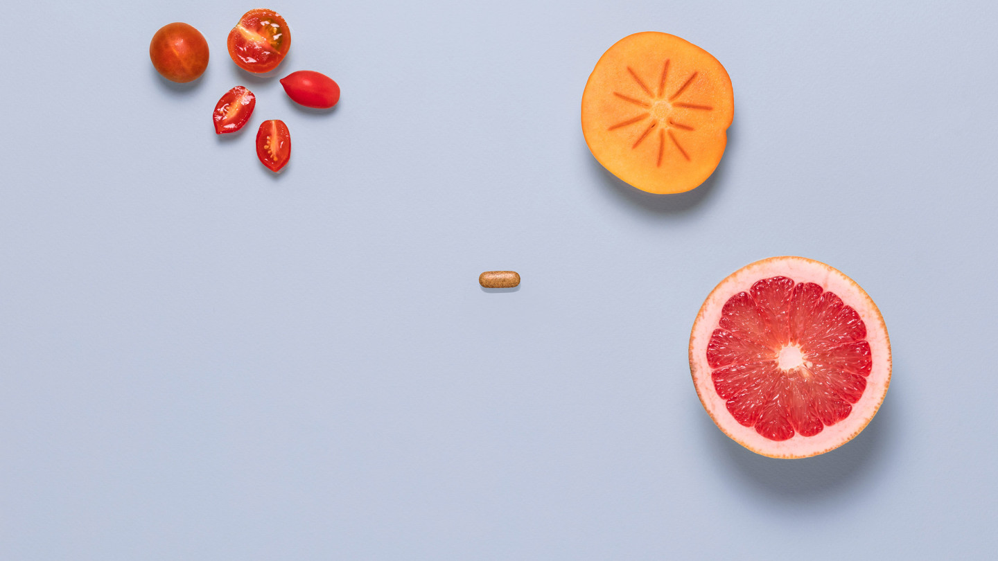
And when you combine type on top of these images, it just looks 🤘. I’m guessing that they did a bunch of photo composites… but it looks good.
White Space
And their use of white space is pretty boss. It’s like a breath of fresh air when you scroll through their site.
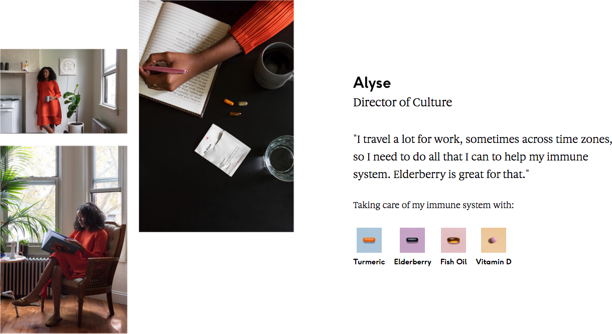
Anyway, I thought this was a good one to bookmark. They made a bunch of pills sexy, approachable and human. 💊
