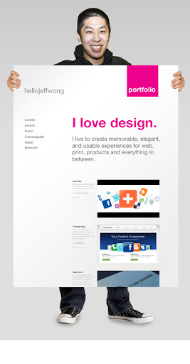
 I sketched out a couple concepts for an updated portfolio site for jeffwongdesign. I’d like to get some feedback on the visual direction. I’m still working out the navigation, how to showcase the work well, and the general experience… but I wanted to give you a sneak peak and get your thoughts on the conceptual direction.
The images and copy are just place holders—you’ll probably notice, I look a little short, and those are not my hands and feet. This is just mock of what the next direction could be. I’ll figure out the details later.
My goal was to seem approachable, friendly, and playful. I figured I’d throw it up and get some ideas. Thoughts?
**update** I just tweaked it again… and added a footer that looks more like my style and identity. I think it will work well between identifying my blog and portfolio.
I just swapped out the photo with a white background. The black background wasn't working… it just didn't feel like me. Anyway, I like this new design better. heh.
I like the clean look and the colors already work great on your current blog-theme. Good job!
Thanks! I just updated the design a little, and tried tying it back to my current template. I think this new one works better as an identity system.
Clean… as always Jeff, good stuff.
Coolness. I'll be posting a couple more concepts this week. I'd love to your eye on it.
I recently came across your blog and have been reading along. I think I will leave my first comment.
I don’t know what to say except that I have enjoyed reading. Nice blog.
I will keep visiting this blog very often.
By the way,
Blogger how when you visit my blog,
My Blog have been created for the satisfaction of consumer of all.
Here the best method for you and get the best penis enlargement pills today.