We just released an updated version AddThis in our labs. It’s been something our team has been working on for a while, and it feels great to see it out there. We’ve made several fundamental changes to the design. I’m excited to say that we’re just scratching the surface and there is more to come.

The Compact Menu
When a user hovers over the “+” icon, a small menu appears with a list of services (like Facebook, Twitter, Etc). Historically, the AddThis hover menu displayed services in a two column format (with a header, title, and dark solid shadow).
As we explored different design directions, we strongly gravitated towards decisions that made the experience simple. All the decisions to subtract, simplify and bring focus to the core sharing experience, shows in the new design, pictured above.
One Column
Rather than designing around a two column format, we scrapped it and went with a one column layout. The one column layout is reminiscent of an OS contextual menu—something that you would expect to see if you right click a mouse. We wanted the new menu to feel smaller and ligher, rather than bigger and cluttered. You’ve probably already seen this single column format in our browser tools and mobile experience. The one column format has been something that our team has been dreaming about, and now it’s finally here.
In order to make the menu one column work, we had to reduce the amount of services presented. There’s a possibility that the reduction of services may affect share rate, but this may be offset by a lift because the menu is easier to scan and is more usable.
Minimalist Aesthetics
Our old menu had a heavy drop shadow, header, and title. We decided to celebrate CSS3 soft drop shadows for the browsers that support it. This new style is more inline with the current design trends on the web, and frankly, it feels more modern. Refreshing, right?
Our sharing tools appear on millions of domains, so the less stylized the menu is, the better. If publishers want a highly custom/stylized experience, they can tweak the design with the API. For the majority of our publishers and users, less is more. There is a lot to be said about an interface that gets out of the users way. Selfishly, I have a penchant for design that’s simple, clean, neutral, and functional… like Facebook.
Blue Links
We’ve tested everything in our menu, including fonts, size, color, etc. Historically we have always used dark gray as the core color in the UI. Being that this is the web, I have personally pushed for using blue links in this new interface—simply for usability’s sake. Yes, the original dark gray links looks better, but blue communicates that the link is clickable. While this may seem like a trivial decision, it actually was challenging to choose functionality over pure aesthetics. But in the end, our interface has to have affordances—users need to know that they can click on services to share. AddThis is served (literally) billions of times a day, so it reaches people in the farthest corners of the internet, across the world, in numerous languages.

The Expanded Menu
As part of the new design, we’ve updated the expanded menu. To make things easier to click, we’ve created larger affordances, larger icons, text, and search. Ultimately, we want the interface to feel easier. The compact menu does the job of being small and efficient. The expanded menu does the job of being easy to search, find, and click.
The expanded menu also now appears in a pop up, instead of an inline DIV. The reason why we made this change was because our interface had a contradicting convention for our menus and services. Some services opened up in new tabs (like Facebook and settings), some opened inline (like the expanded menu and email), and some opened up pop ups (like Twitter). We wanted more continuity, so we decided to present the user with a pop up expanded menu when they clicked on “more”. The main benefit is that it reduces the code dramatically, which in the end, helps load time and overall performance.

Example of Sharing in a Pop Up
As you can see, the movement towards the pop up convention (like Twitter) makes the interface for most services nice and easy to use. A huge disadvantage of opening things in new tabs is sometimes an interface may not be designed for a large browser dimension (like 1600×1200). At certain scales, some interfaces are actually less usable, and we have no control over it. For now, the pop up seems to be the most logical solution. We will be continuing research and monitoring how this affects share rate performance.

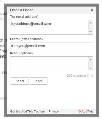
New Email Form
Lastly, we’ve updated our email form. The old form felt dated, and had virtually invisible buttons for sending a message. The new design uses a clearly called out “Send” button. To encourage the user to share, we removed the “Cancel” button. This makes our UI cleaner, and will hopefully increase email conversions. If the user wants to close the window, they just use the standard browser controls. The refreshed look also is sexier and borrows a lot of elements found in email applications, iPhones, iPads and so forth. We want email to feel more like a proper email message. We’ve even added a option to remember the sender’s email address, so that the next time they send a message, they don’t have to type in everything again.
Where can you get the new AddThis sharing tools?
If you like what you see, you can grab the new sharing tools from the labs page. You can also play around with it on my blog. As always, I highly encourage giving feedback.
Wait, I have AddThis already… isn’t there an easier way to update it?
Oh yeh, by the way, it’s really easy to update if you have AddThis javascript on your page. In the JS, where it says “src=”http://s7.addthis.com/js/250/addthis_widget.js”, just change “250” to “300“. It takes literally one second.
Kudos, props, and love…
Huge props to the team for pulling this together. I’m really proud of everyone—their effort and meticulous attention culminates in this new design. We’re really starting to get some momentum and “Zag“. I can’t thank everyone enough… so I’ll just mention some highlights: in particular, I’d like to give a shout out to Foo, Jim, Matt, Will and all the QA, Ops, and Happiness team. This is an excellent blend of UX, design, engineering, and product vision.
Jeff, this is awesome! Â Great work!!!!!
dude, props to Clearspring and AddThis. this is freaking cool.
@twitter-71903:disqus thanks man, really appreciate it. we miss you over here! hope all is well in dc! if i’m ever in your neck of the woods, it’d be great to hang out again.
@wings thanks man! it’s really rewarding to hear that. i hope the rest of the world feels that way too about the new design! 🙂 Â as always, feedback is welcome mang!