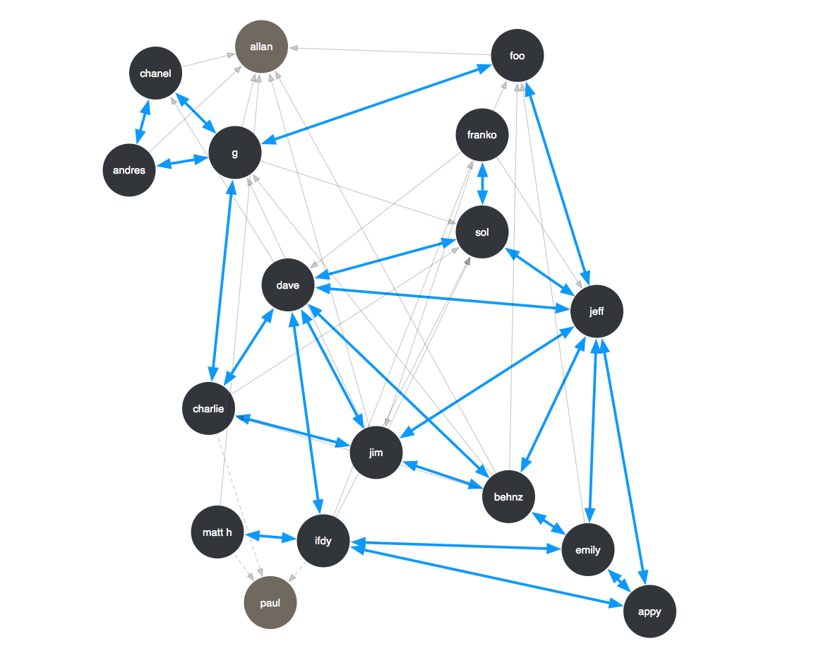
To optimize our seating arrangement at AddThis, I took a survey within our team and created a visualization of our daily communication patterns. Gray represents 1 directional communication, and the blue represents 2 way. I wanted to focus our seating arrangement based on 2 way communication and realistic collaboration.
I did one a while ago and the interesting thing is that my communication pattern is almost identical. I’m also flattered that I have so many 2 way communication channels on a daily basis. ^_^