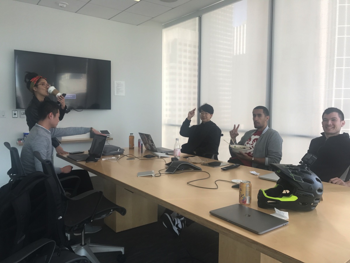
James Donovan and #squad doing a design review during lunch.
I spent the majority of this afternoon hanging out with some other designers in SF. The caliber of talent here is amazing. I had a great time doing a design review and talking about trends, philosophy, and our current challenges as designers.
It was refreshing and these guys lifted my spirit. They were passionate about design… and they really cared about the details. They’re also specialized at what they do–like a surgeons knife–illustrators, systems design, visual design, interaction, etc. It’s fascinating to see how deep their expertise goes in each discipline.
It’s been a while since I’ve had a chance to do a design review with other creatives. A lot of times I’ll get feedback from people, but you really have to un-package what they’re trying to say. I enjoy the challenge, but working with folks in the creative field gives you a chance to talk in the same language. Sometimes it’s nice to talk about pixels. It was a breath of fresh air and it makes me want to step up my game when I hang around these guys.
So let’s recap some of the trends we talked about in our design review…
Trend #1: Circular Font

Circular is the new Helvetica.
As far a design trends go, we felt like certain fonts like Circular have been pretty much adopted by everyone. AirBnb was one of the first to really make this font mainstream, but it’s pretty much everywhere now. Even Atlassian is using it–check out their graphic standards manual. Eeeeeeveryone is on the circular train. But my god, it looks so good.
Trend #2: Flat Illustrations

A flat illustration from Slack’s website.
Again, it seems that this trend has been going strong for a while, and we’re starting to see everyone adopt it. Not to pick on Atlassian again, but they are also using this exact style in their illustrations. Even Uber uses a variation of it if you scroll down parts of their site. Same goes with Evernote, and our friends at Shift.org. It’s hot right now.
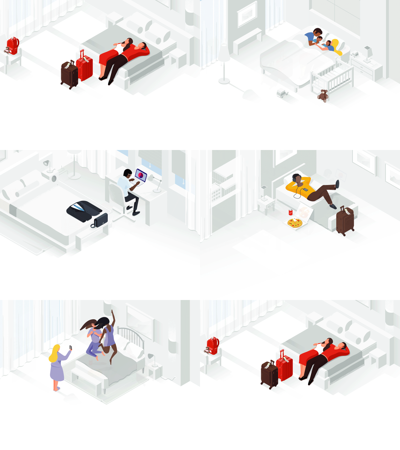
Google Hotels, by German Kopytov for Google.
One of the more popular styles that’s starting to catch on is isometric illustrations and renderings. And the folks that can add subtle animation to it are the champions.
Trend #3: Studio photography with solid backgrounds.
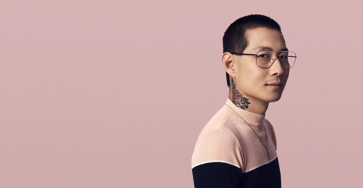
Photograph from Squarespace.
I’m really digging this style of photography, and I love how the background color matches the color of the model’s sweater. I think the other important thing to notice is that the model has a tattoo and a little swagger. He feels human–a person that you could approach and talk to. The last thing to note is the lighting seems like it’s coming from a single source, most likely a large lightbox/strobe. The entire photo is sharp, so they’re probably shooting with an 85mm at f8. The edges are crispy, and the exposure is perfect. I’m going to see if I can replicate this on my own… heh.
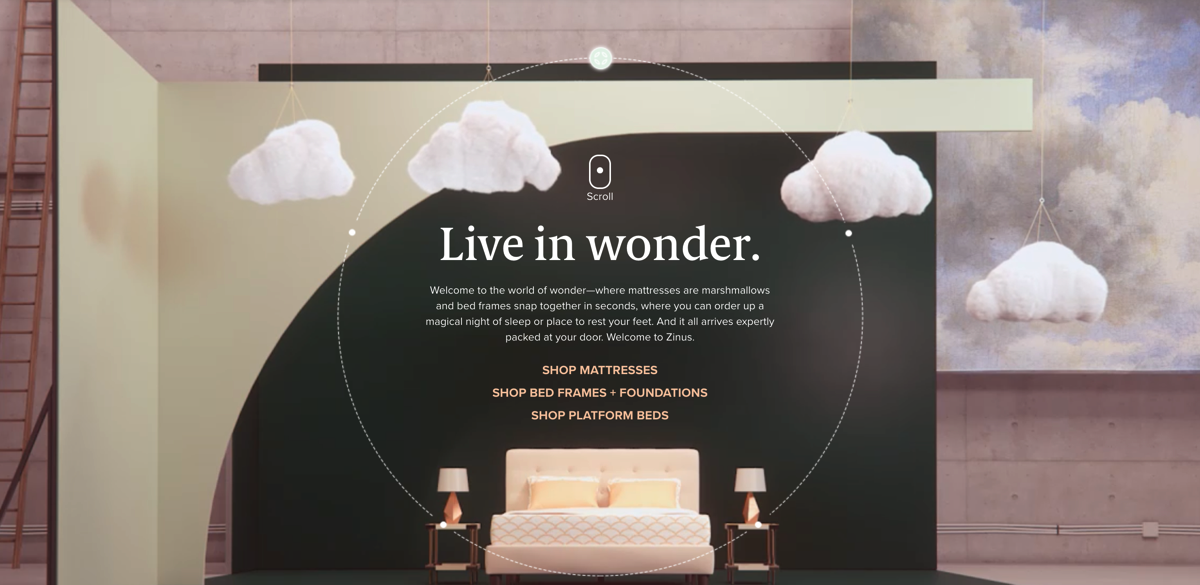
Aaaaaaaand, the people that add some subtle movement to it are going to be the champions.
Ps. if you want a little more inspiration, you should check out these other two sites:
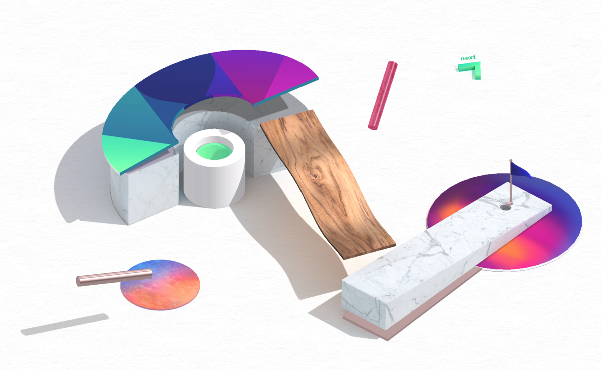
Makemepulse.com, Hat tip: James
Pss. After hanging out with these guys, I’m wondering if I should do a video series of designers talking about their tools, process, and potentially doing design reviews of new products. I wonder if other designers would geek out watching them pixel push their sketch files. Selfishly, I want to pick their brains and learn all their trade secrets! Hah!