New AddThis Business Cards

Since I now officially work for AddThis, I wanted to share our new business card design. The cards came out very well, considering that this was the first real print project I’ve had in years. It sure beats the generic 4 color digital printers out there.
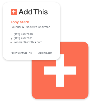
bcards.png

Not everyone is always a fan of “different”, but I think this makes our company and employees feel less corporate. When given the choice, I always hope our company will favor a bolder and elegant direction.

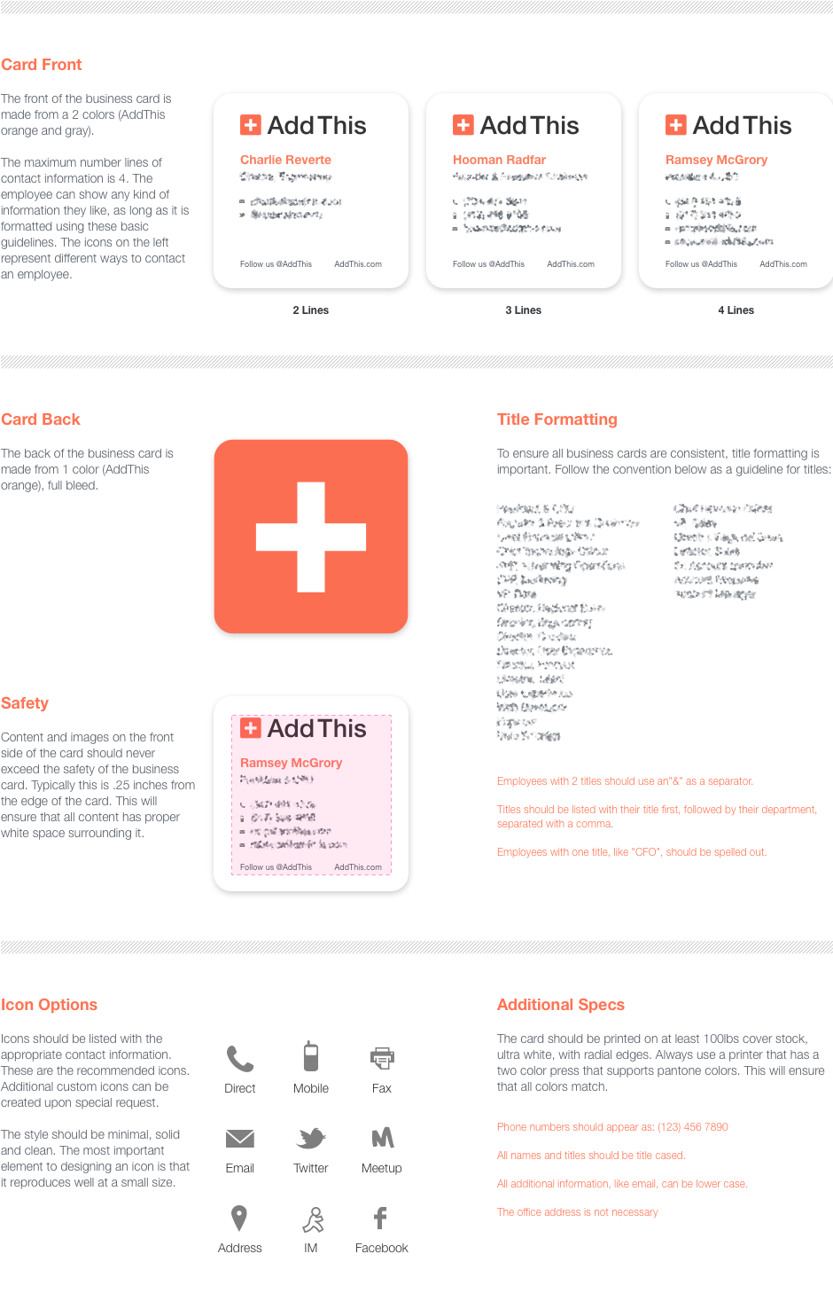
Here’s a short one page spec that explains the design a little more. It’s part of a larger graphic standards manual that will be online in the future.
bcard_spec.png

Anyone want to trade business cards? 🙂
New AddThis Rebrand

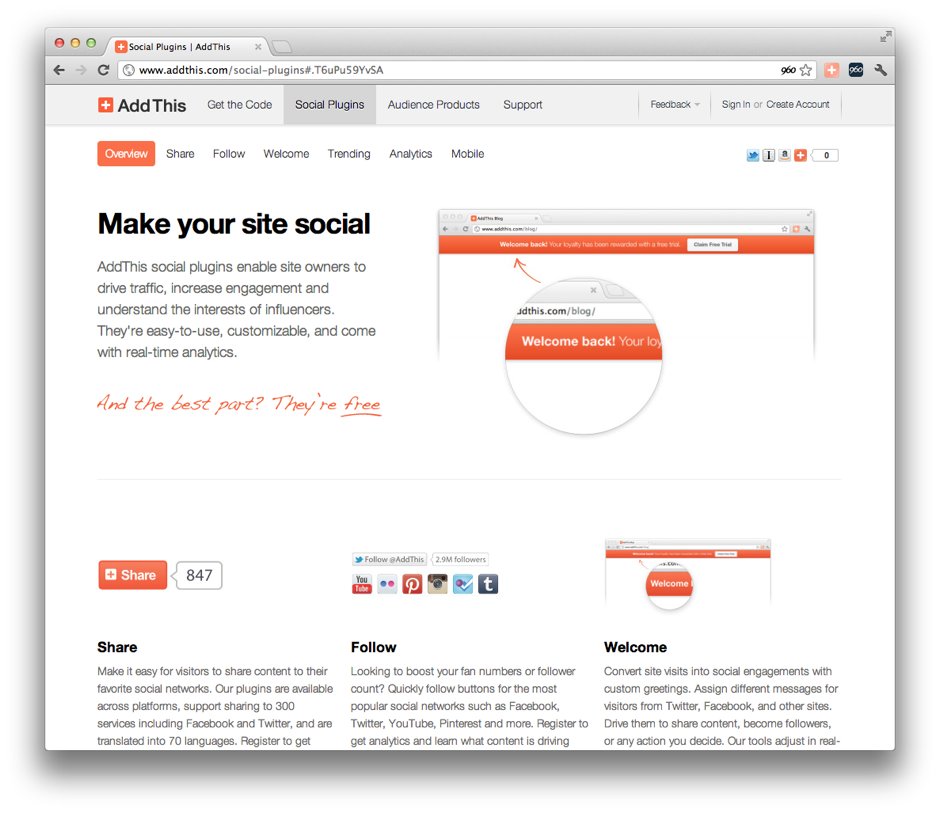
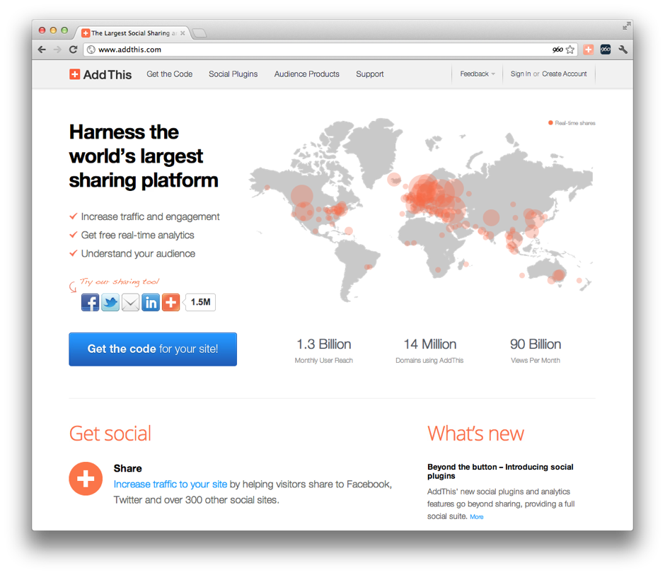
If you were wondering why I haven’t been blogging much over the last month, it’s because I was working on rebranding AddThis. The new brand is the convergence of 3 entities (AddThis, Clearspring and XGraph). I’ll do a followup post on nitty gritty design stuff, but for now, visit the site.

I wanted to take a moment to give our team a shout out. In particular, I’d like to thank Foo, Jim, Hooman, Ramsey and our marketing team for pulling this together.

2012-05-10 05.41.43 am.png

2012-05-10 05.52.08 am.png

**update**
I also wanted to mention some other folks–I was sleep deprived. An extended shout out and thanks goes to will, Aaron, Matt c., and the entire dev/engineering team. This site was a collaborative effort by our organization. I’m really proud of our team.

Send Feedback

Here’s a little UI styling I created recently for a feedback mechanism we’ll be adding to our site. I’m not a big fan of floating tabs, but it seems to be the most logical solution. What do you think?

send feedback.png

Hackathon

hackathon_team.jpg

Every once and a while we have a hackathon, and it’s fun to get together and work with the team to put together a working demo within 24 hours. I’d love to show you the project we worked on, but it’s possible it could get into the roadmap—so I’ll just have to keep the screenshots on the down low for now.

I had a chance to work with a bunch of new folks, and it was pretty amazing what we were able to accomplish. Here’s the team I had the pleasure of joining forces with.

Here are some previous hackathons:
June 3rd, 2011
October 11th, 2010
May 3rd, 2010
Sept 16th, 2009
June 9th, 2008

AddThis: Designing with Data

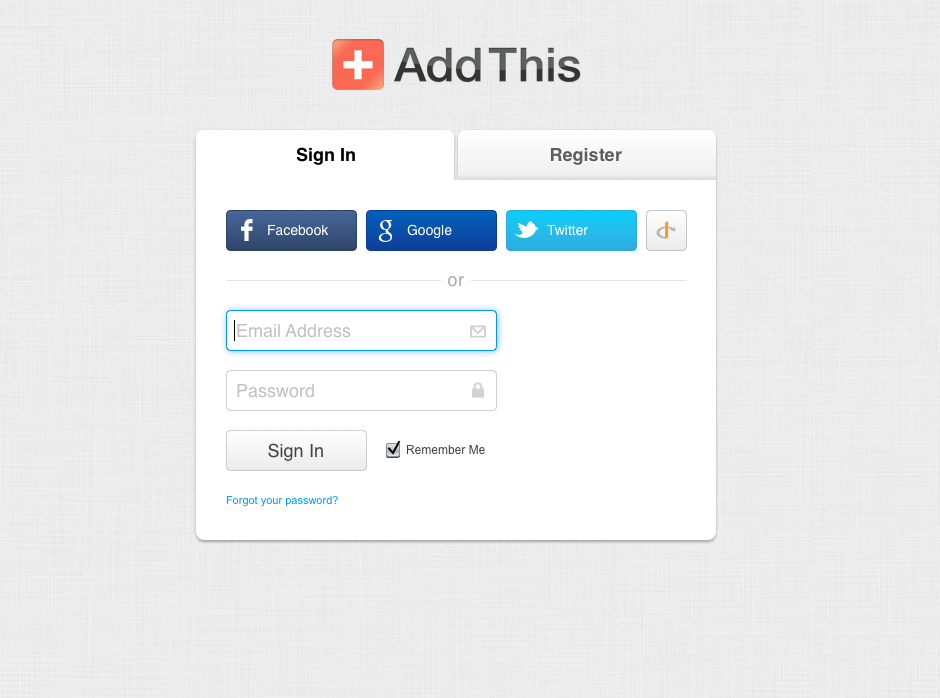
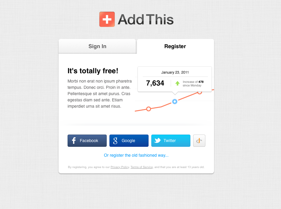
We just finished running a test to see if we could increase Sign In and Registration conversions. Unfortunately, our test cell performed worse… which was a total bummer.

The good news is that I think I know why the conversion rate went down. Hopefully we can continue testing and refining this part of our site. The advantage of making it a test is that there is very little risk involved. I’m looking forward to using these new insights for future designs.

I can’t share the data, but I can show some screenshots.

sign.png

reg.png

Kudos to Foo and Aaron for making this happen. As much as it’s a heart break to see a failed test, I think we can transform it into a big success if we make a few tweaks.