I enjoy the Harry Potter series, but I have no clue what my coworkers are talking about (in terms of spells). I love how geeky everyone is here.
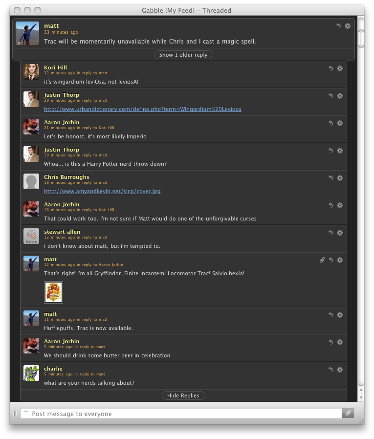
I enjoy the Harry Potter series, but I have no clue what my coworkers are talking about (in terms of spells). I love how geeky everyone is here.
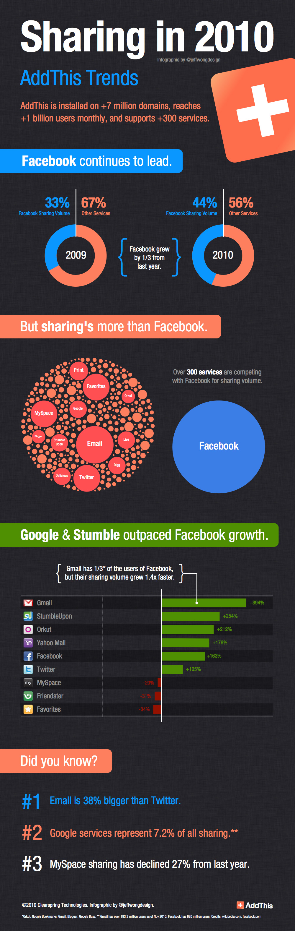
Here’s an infographic I whipped up yesterday with Hooman and Justin. Glad to see it was well received on mashable, readwriteweb, theatlantic, allfacebook, and techcocktail. Huge kudos to all my comrades at AddThis. 2010 has been quite a year. BTW, if you want to see some of my inspiration for this infographic, check out my other site: visualizationporn.tumblr.com.
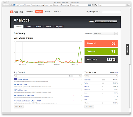
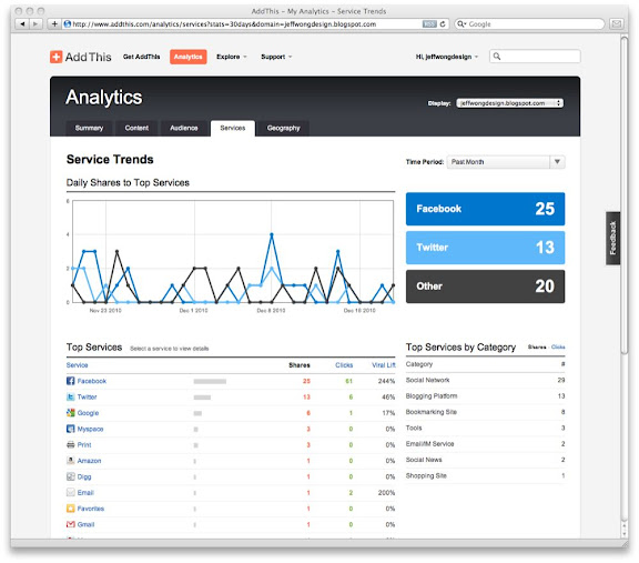
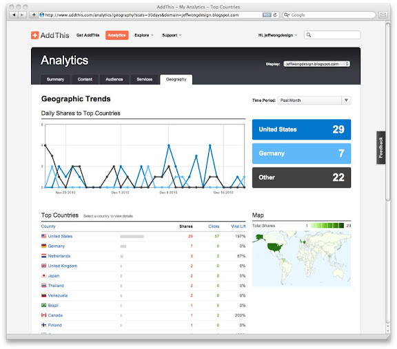
Over the last few weeks, I’ve been working on the new AddThis Analytics. This is the 3rd generation, and it’s come a long way. I’d like to talk a little more about the design. You can read all details about it on the AddThis blog.
Introducing Analytics Version 3.0
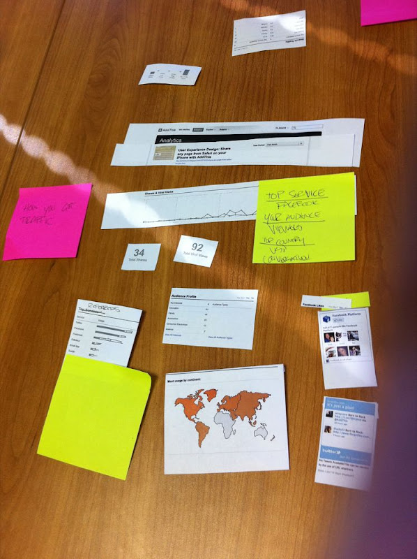
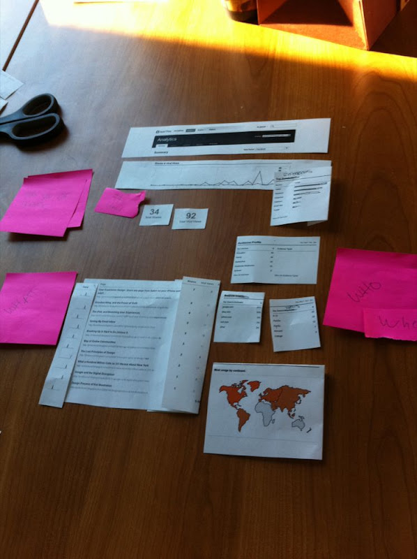
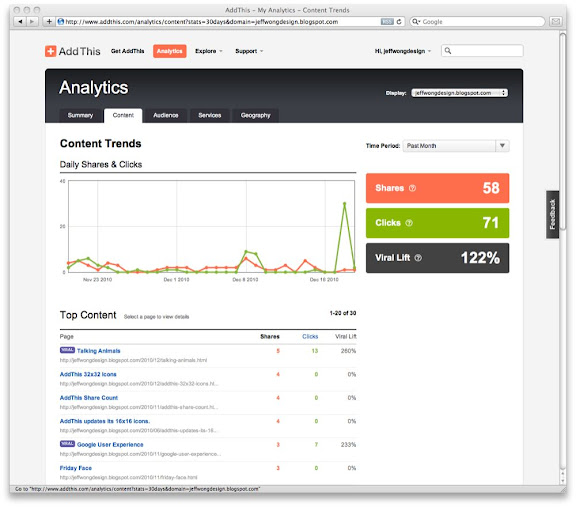
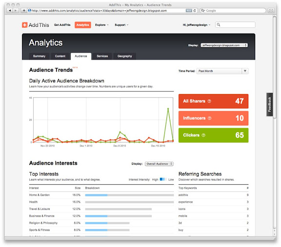
Our previous generation showed everything about shares… but very little about what happens after something is shared. The new analytics tells different story—how someone found you, how a user engaged with content, who came back from the shared link, and what their interests are. The images below are screenshots of our new analytics.
Process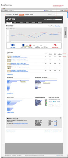 The original wireframes were created by Jim (pictured right), and we prototyped it to see what data would look like. When we populated the original reports with real data, everything changed:
We discovered interesting things:
• The funnel visualization, while interesting, was confusing
• Top content took too much space in a Summary page
• The Snapture screenshots were not helpful
• We couldn’t do social mentions at a domain level—too slow
• Share velocity doesn’t make sense for smaller publishers
• The page felt like it was scrolling too much vertically
• New queries were affecting performance
• We wanted to know more about Audiences and their Interests
The bottom line was that we all had to challenge ourselves to show the data in a more compelling way. So, we grabbed a room and reworked everything. The images below show how we shifted components around to tell a story. It was important to show the data in a specific hierarchy, so the reports could convey interesting correlations and deltas.
While this approach requires more rounds of revisions, I think we ended up with a better product—a product that we would have never arrived at, if we didn’t challenge ourselves.
The Video (watch)
Lastly, the video was created immediately after the reports were finalized. Huge thanks to Kori for laying down the vocals. She’s a rock star.
The Final Result
After weeks of revisions, exploration and tweaks, we have something that I’m really proud of. I’m excited to see how our entire team pulled this together quickly. Huge high five to everyone.
When we launched the AddThis 32×32 icons a few months ago…
we wanted to make sharing easier to click and easier to touch. Bigger icons proves to increase sharing… but there are some challenges that come along with size… like alpha transparency, size and load time, loss in fidelity when scaled from 16px to 32px.
Some of our Challenges
To make sure alpha transparency looked smooth (like corners, shadows, etc) we’re using a 24bit PNG format. To ensure a small/fast size, we’ve compressed the images and created a sprite. To make sure icons upscaled nicely from 16px to 32px, we’ve re-drawn a large number of the top services.
Examples of Rescaled Service Icons
However, there are still a lot of services that need to be re-drawn. I’m going to take a little time each month to sharpen them. Here’s an example of Yammer, Email App, Plaxo and DesignMoo… compare below:
Old:   


New:   


Dark Background
You can really see the difference when you compare them on a dark background. I created this page to show my comrades the difference.
If you have any special requests or larger icons you’d like to submit, please leave a comment.
I spent last night hacking away at my parked page at jeffwongdesign.com. I added a bunch of stuff to make it a little more interesting. FYI, I’m not a developer, so this was a total hack based on a bunch of stuff I found on the web. Check out some of the sources below…
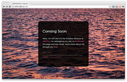
Random background image with PHP (Get Code).
In order to randomize the background, I used a PHP script. Then I changed the CSS to call the .PHP file. Then I set up an image folder, and point the PHP to it. I dropped about 15 optimized images, and viola! Randomized background images.
Full screen background image with CSS (Get Code).
In order to make the screen scale perfectly to the browser size, I used some CSS that updates the background on the fly. As a bonus, the site always shows a full image for any screen (even iPhone/iPad).
Custom AddThis button (Get Code)
I used AddThis for sharing/bookmarking, and simply transformed some text into a custom button. To make the menu appear beneath the text perfectly, I added a custom offset. The best part about AddThis is that it has a special custom interface for iPad and iPhone… so my site looks great on mobile devices.
Custom Twitter feed (Get Code)
I added a custom Twitter feed that pulls in my last tweet with a json call. I was surprised how simple it was to do—it’s pretty much plug and play.
IE browser tested
Foo checked out my site this morning and noticed that it didn’t work in IE. My CSS3 alpha background was gone… So instead, I stretched a transparent png as the background, so that it works in IE.
Centered DIV (Get Code)
In order to center the DIV (the black box), I borrowed a little javascript. Now the DIV is centered horizontally and vertically.
Custom Font-Face (Get Code)
I wanted to try loading in a custom font, “Museo”. You basically need to gave the TTF, EOT and SVG and link to them with CSS.
 My partner in crime, Jim Lane, is giving a presentation at Refresh DC on Tuesday, Nov 16 from 7 – 9PM, Located in Alexandria VA. The title of his speech is “Designing for One Billion People”, and it will focus on how AddThis has grown since its acquisition in 2008. Click here to learn more or attend this event.
Jim will be discussing how a small team grew AddThis into the largest sharing platform in the world, reaching over one billion people. Starting with a modest interface, the team has focused on reaching the widest possible audience by keeping design and branding simple, and putting users first. Because of the platform’s large scale, the team has been able to iteratively measure and test in order to direct design and development. In addition, the team has tackled interesting challenges in scaling the product and architecture to a multi-national audience, while maintaining an effective user-experience (and keeping our CFO happy.)
 Who is Jim Lane?
Jim plays a huge role at AddThis, and is one of the best I’ve ever worked with. While most people may know him as a User Experience Designer, he is an outstanding product manager, project coordinator, and wears about 10 other hats. He is truly a catalyst amongst our designers, developers and executive team. To our team, he is a fierce comrade, leader, and friend.
 So who’s coming to this event?
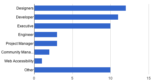
There’s a growing attendance list, and I put together a quick little spreadsheet so you can get a sneak peak. There’s going to be a nice mixture attending, so you’ll get to meet a ton of people (folks from OPower, AOL, Living Social, Washington Post, Viget Labs, and more. The AddThis and Clearspring Team
A bunch of our team members will be there to hang out and meet everyone. Here are some people from our team: Charlie Reverte, Yuesong Wang, Justin Thorp, Will Meyer, Tabassum Jahangir and Stewart Allen. I suspect that more people will sign up as we get closer to the event deadline. Clearspring is hiring, so please come out if you’re interested in a position. Here are some jobs.
Ice Breakers
Jim’s super easy to approach and has a stellar sense of humor, but if you need some ammunition to break the ice, here are some things that he absolutely loves: Data, Search, Scotch, Swimming, Great danes, Dolphins, Purple, Nine Inch Nails, and Coffee.
 Stalk Jim Lane:
There are many ways to stalk Jim, but if you’re not sure where to start…Search, Blog, Facebook, Twitter, LinkedIn