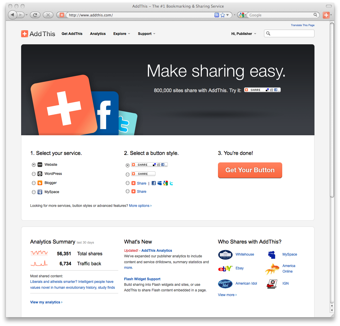
I’m happy to announce that we finally released better looking 16×16 icons for our sharing tools this morning. Originally, we used the 16×16 favicons directly from our services, but we found that most of them were only optimized for a white background. I’ve done a quick comparison of a couple services to show you the difference.

This is a 400% magnification of our old and new 16×16 icons. The new icons are more “chicklet” styled so that they look more like buttons. They’re also more consistent and visually hold together as a unit. Since the icons have to be super compressed (to load quick), I had to manually tweak most of these icons and transparency to optimize correctly when we compiled them into a sprite image. The best part is that the icons look great on black—this has been a complaint from our publishers that use a dark background.
While this is a small detail, I think that it will be a nice update to our product. I’m glad we were able to squeeze this one in for this release.
 Here was the original hand sketch. I was able to knock it out in a couple hours in illustrator. If you’d like to buy a tshirt, visit the following:
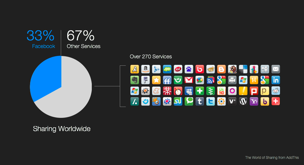

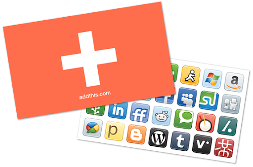 I mocked this up this business card concept for AddThis recently. You’ll notice it has no contact information… it’s just a simple card that shows an abstraction of the AddThis logo on one side, and tons of services you can share to on the other.