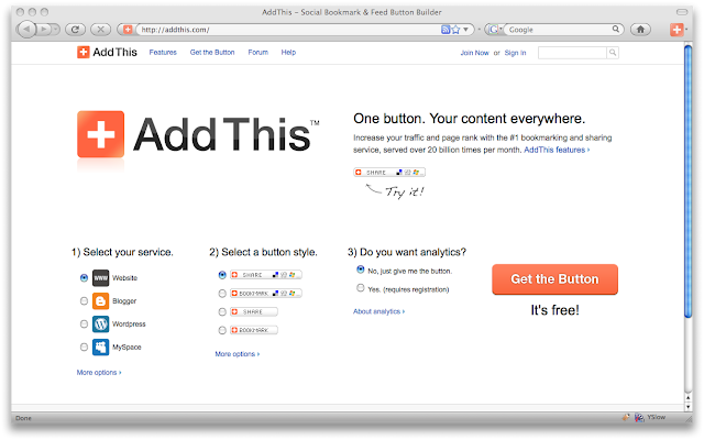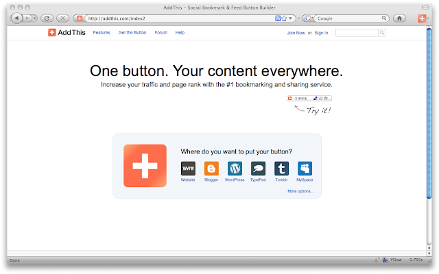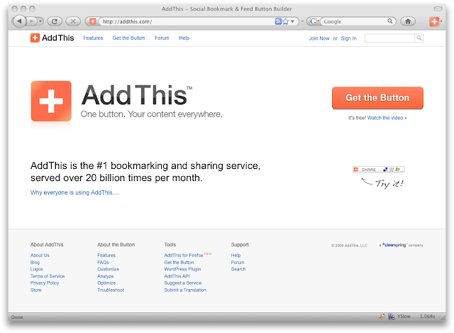
new grid: we’ve locked everything to a 960 grid. the entire site follows a really nice grid system which has made design and development much easier. the site is also much cleaner since everything is aligned perfectly.
navigation: we’ve revisited the site architecture to accommodate for new pages. you’ll notice the footer at the bottom has been introduced (but simplified dramatically compared to the original design).
visual styling: we’ve flattened the entire site—minimizing any use of gradients, drop shadows, etc. we’ve tried to keep the styling as simple and utilitarian as possible. this means the site loads faster and overall performance is better. we’ve made slight tweaks to type color and sizes as well. for example, we darkened the blue links as well as made all body copy darker. we’re aiming to make sure everything is as legible as possible.
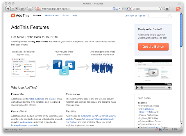
new features page: this page talks about all the benefits and features addthis offers for your blog and page. it also shows a list of ton of large publishers that use our product. you’ll notice the call to action is clear in the top right corner with a small video in the sidebar. this is going to be a new convention we’re hoping to include on all page. the videos should be a nice feature for people who don’t like reading. heheh, and i just like having small videos sprinkled throughout a site. we’re taking advantage of youtube to host our videos, which is so much easier than hosting it yourself.
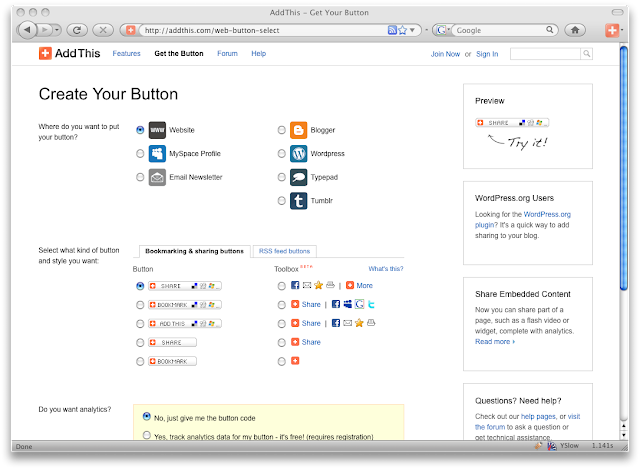
updated get the code page: we’ve made some tweaks to this page. “what type of button” used to be a drop down menu, but we decided to change it to a tab. i believe it’s much easier for a user to see their options with this convention versus the drop down menu.
new toolbox: we’ve launched a new product called “toolbox”, which is offered on this page. i’m actually using a customized version of it on my page. it’s a really nice feature of our product which allows the publisher to customize their sharing tools. i really love the way it works on my page. this was something i designed with the team 6 months ago. it’s awesome to finally see it come to life and on my blog! i have a good feeling we’ll see alot of people using this product for their page.

updated analytics: we’ve finally added a date picker for the analytics. this allows you to select a specific date range to generate a report. i’ve been waiting for this feature for ages. this will make it so much easier break down my analytics and zoom in on specific time periods.
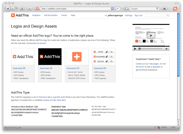
new logos page: this page gives the user access to all the source files for our logo and button. the idea is to make our logo as open as possible. traditionally, i’ve been trained not to do this… but i believe that the more open you can make your brand, the more people will embrace it. twitter is a great example of a company being open with their brand and product. afterall, a brand is not what you say it is… it’s what the people say it is. so let the people be as involved as possible and let them help you create it.
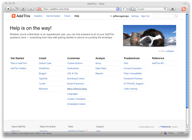
new help pages: this is probably one of the largest improvements we’ve made to our site… we’ve spent alot of time reorganizing our help section to make it easier for users use. we’ve added more docs, more visual guides, etc.

new visual guides: as part of making our help section better, we’ve added visual guides that walk a user of any experience through the process of adding a button their the page.
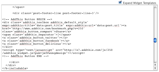
simplified code: the code above is so much more simple than what it looked like before. this is a simple little change, but our developers have done such a nice job of making this easier to digest. i have very little css coding experience… and editing the API was so easy. i would say i represent the largest common denominator for inexperienced. the fact that i could do most of it without using the docs was amazing.

address book with typedown addresses. if you use the email feature, you can use your address book. it also has a type down email feature which makes it so much easier to find an email address.
there’s a ton more stuff we’ve done in this release, but this is a quick highlight of some things we’ve touched off the top of my head. i’ll be blogging about more specific features and design rationale soon.