which one do you like best, and why? your feedback will help me alot. please comment. ^__^
addthis button.![]()
sharethis button.
add to any.
![]()
which one do you like best, and why? your feedback will help me alot. please comment. ^__^
addthis button.![]()
sharethis button.
add to any.
![]()
as you know, i’ve been working on trying to add more personality to the addthis logo. the key word i think that i’m hearing more around here is “fun”. i’m really happy with the direction… and the series is really starting to take shape. check out the last logo variation i created.
what do you think? does it feel fun? ^__^
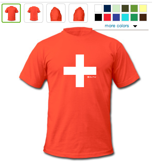
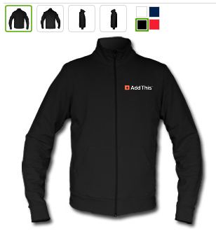
just finished designing and ordering these two last night. hopefully they come out alright. i’m a little nervous about their printing process—i read up about their digital print transfer and i’m not fully confident it will give me the results i’m looking for.
they definitely look cool on screen. i should be getting them sometime next week. stay tuned!
 |
| From jeffwongdesign |
 |
| From jeffwongdesign |
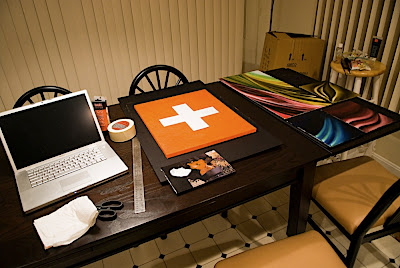
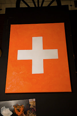
here’s another new painting i finished tonight. i wouldn’t really called it art though… it’s more of an illustration. typically i don’t like to do this kind of work, but i actually found it quite satisfying. the designer in me really appreciates simplicity, color, composition, and symbolism. i feel that i may do more pieces like this… they certainly look good on the wall.
as you can see, my inspiration comes from our addthis logo. (which is essentially an orange version of either the swiss flag).
 |
| From jeffwongdesign |
just as a side note, i really love swiss design. they are brilliant, as are the german modernist camp, aka bauhaus.
 |
| From jeffwongdesign |
this year my goal is to give addthis more personality and charisma—to create not just an icon that means “share/bookmark”, but something fun… really fun. something that can communicate humor, feelings, and become something people love. this is a goal i’m really excited about because our entire team really embraces the direction. ultimately, i think it would be even better if we could make our logo open source for anyone to play with. if you know anything about branding, you’ll know that people define the brand, not the company. what i hope to create with the team is an avatar.

for the sake of simplicity, read “The Brand Gap”, by marty neumeier. he captures alot of what a brand should be in a nutshell. the book takes about 45 minutes to read, and it’s easy to understand. you can get a quick sample of it in this presentation.
one of the slides says, “how do you know when an idea is innovative?”. answer: “when it scares the hell out of everybody”. i don’t think this scares the hell outta everyone, but it sure does feel good. it’s been a while when i was worried about bastardizing a logo… but for some reason, it feels very web 2.0. it feels right. it breaks the rules. i love it.
what do you think?
i created a new video for addthis. it was done relatively quickly—let me know if it makes sense. go to addthis.com to give it a try!