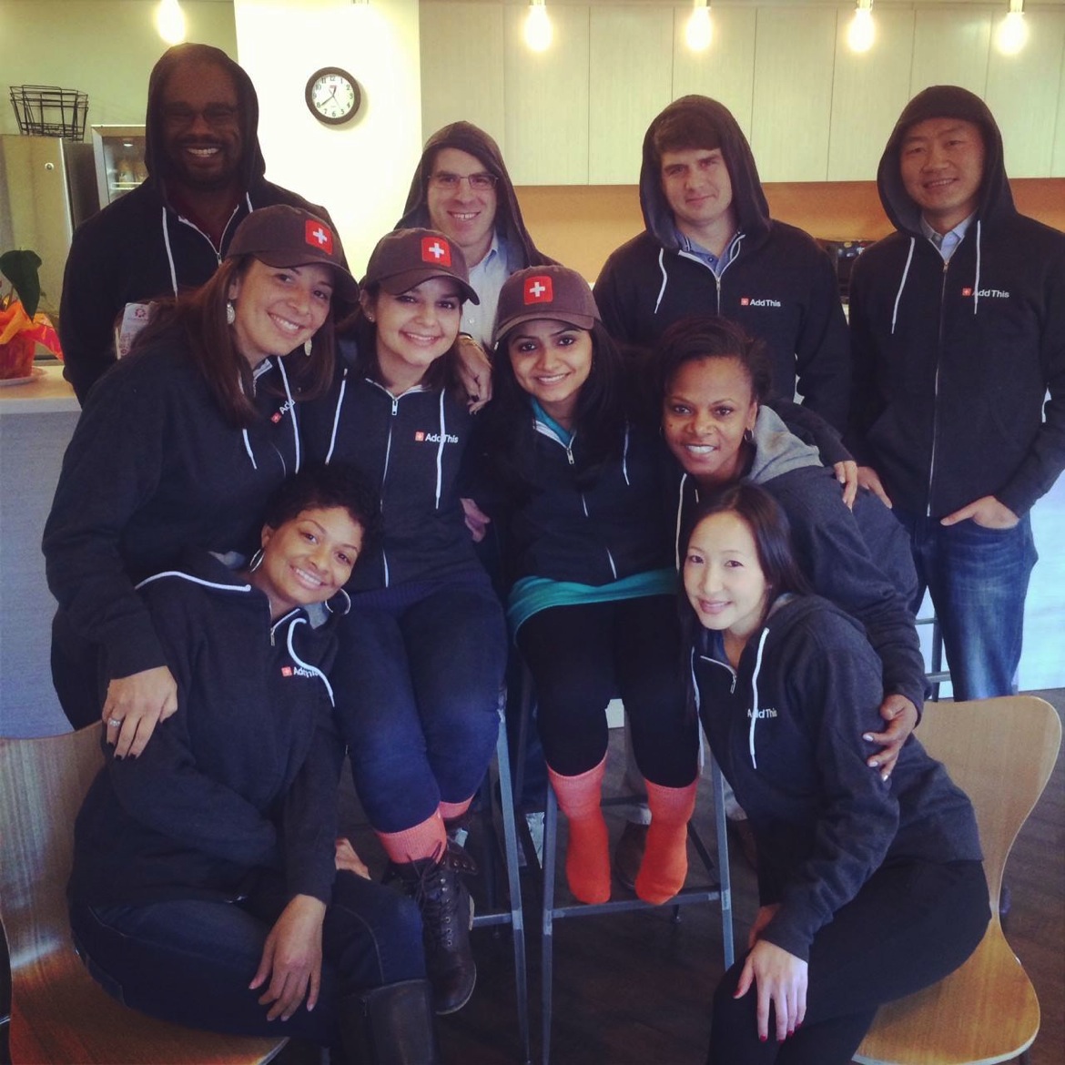
We just released the new 2014 line of AddThis swag. We’ve got new hoodies, socks, blankets and more. Big hat tip to Appy and Bhavna for making it happen.
Appy’s Back!
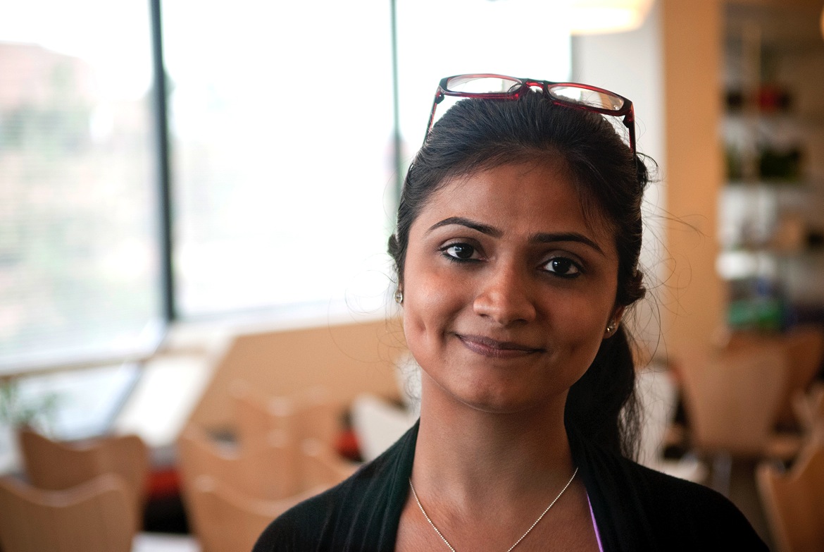
I’m just so excited to announce that we’ve hired Appy back. After impressing us with her work ethic, positive attitude and penchant for clean design, she’s earned herself a spot back on the team as a full time designer at AddThis. I’m really looking forward to seeing her shine.
Read more about her internship here.
My Desk + New iMac 27″

No more old slow ass laptop. It’s been replaced with a brand new iMac 27″. It’s got a Quadcore 3.5ghz i7 Processor, 16gb Ram and 500mb of SSD. This thing is FAST. It does a cold boot in 12 second. Launching Photoshop takes 2 seconds. Finally, at last, my prayers have been answered.
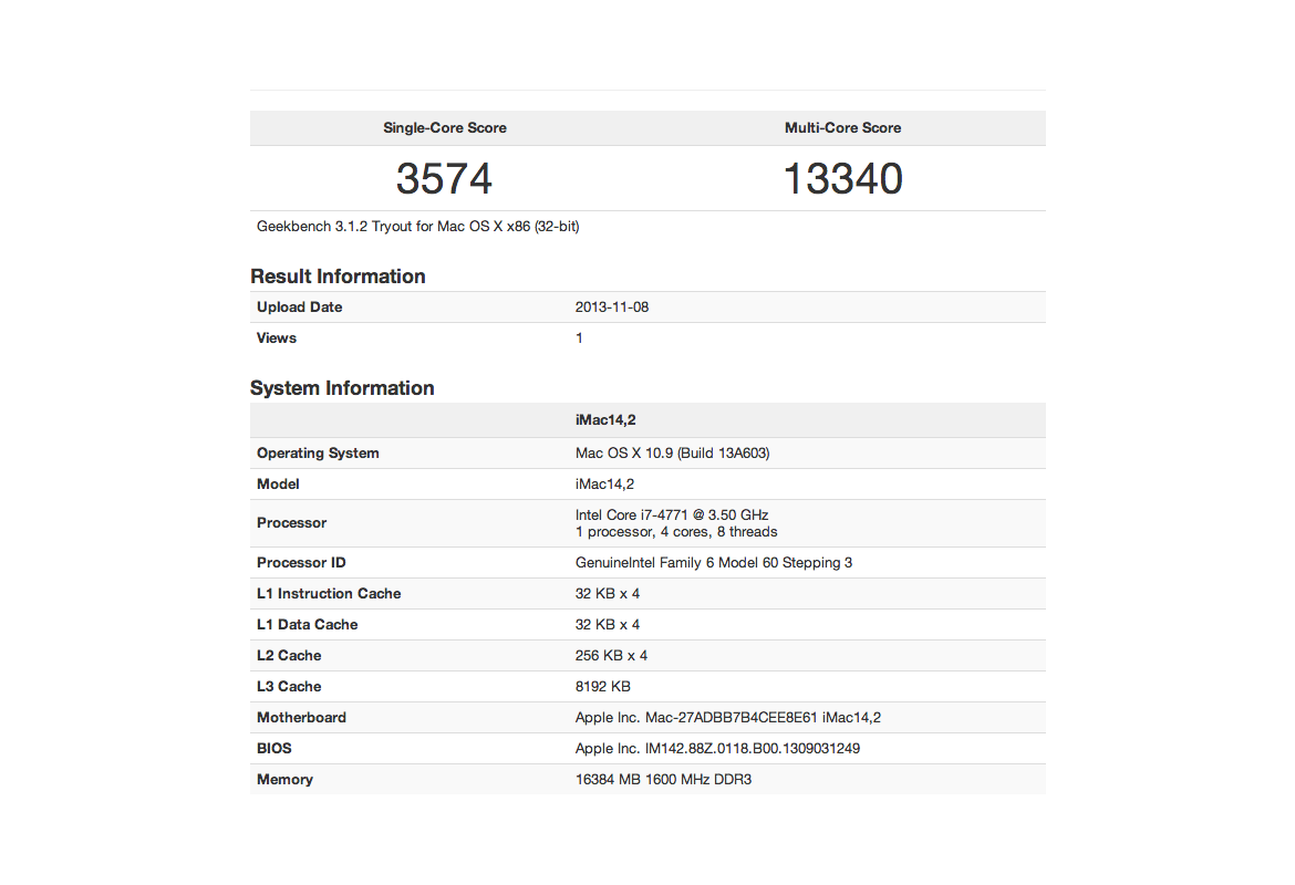
Here are some numbers from geek bench. While it doesn’t score ridiculously high, it definitely feels snappy. I am one happy designer right now. Sadly, it took me an entire day to manually migrate over my files… the Apple migration program failed. Oh well, sometimes it’s better to start from a completely clean slate.
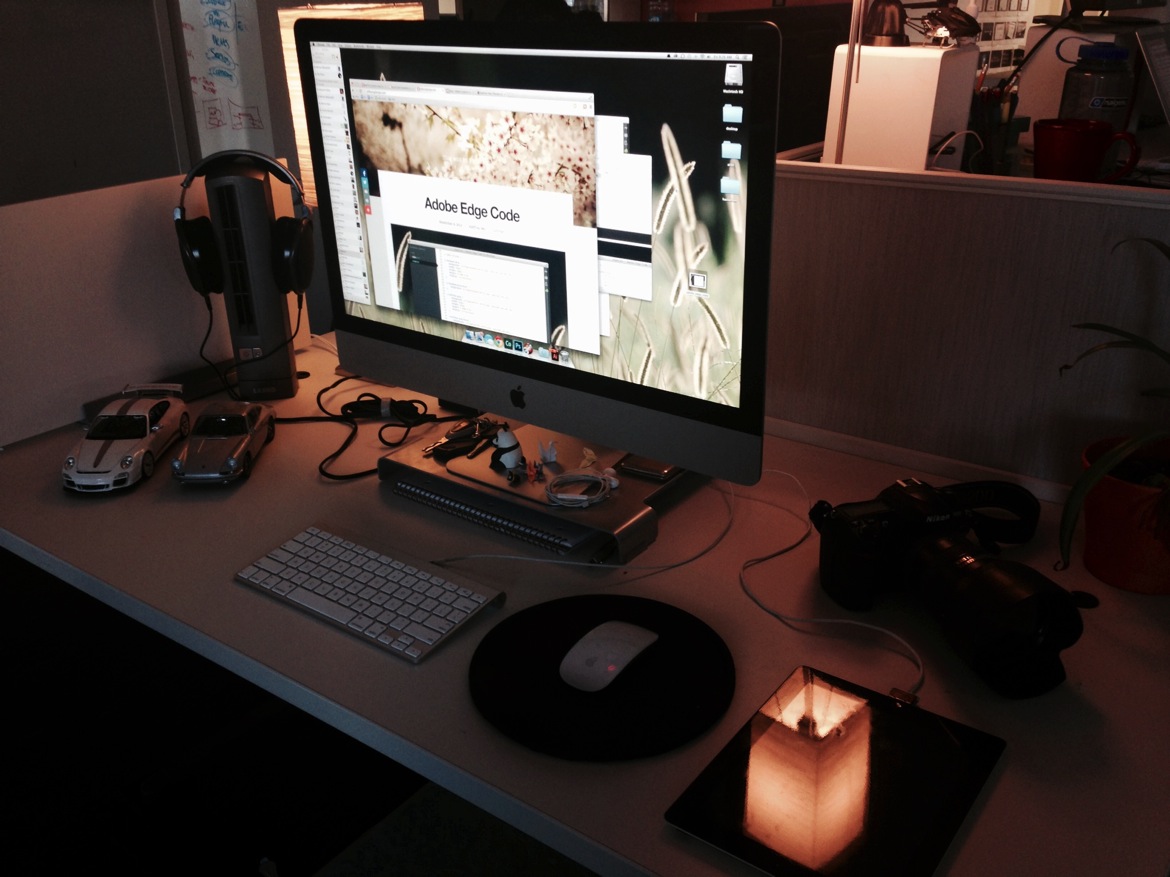
Thanks AddThis for upgrading my computer. I’m really looking forward to crunching some serious design through this new machine.
Adobe Edge Code
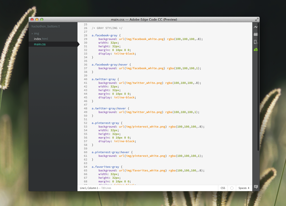
For my hackathon, I designed and coded up some new sharing buttons using Adobe Edge Code.
I was trying to decide between a couple different dev tools: 1) Sublime Text, 2) Coda, and lastly 3) Adobe Edge Code. Since I had Adobe Cloud Suite already installed on my computer, I figured it was time to give some of the new software a spin. After playing around with it, I’ve decided that I really like it. The only thing I wish it had was built-in FTP and SVN support. Call me lazy, but that’s the way I roll.
New Office Layout
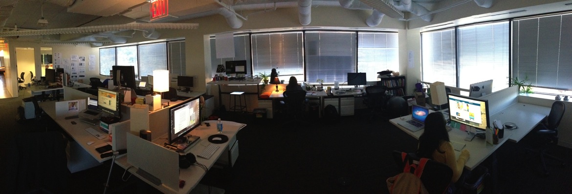
Based on the diagram I created, we reorganized our team’s space. I’m hoping this will help us collaborate and do great work.
Communications Diagram
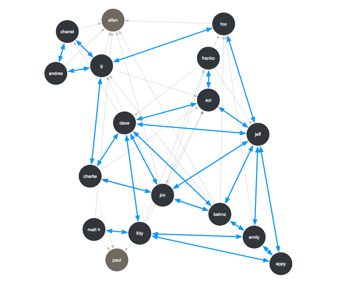
To optimize our seating arrangement at AddThis, I took a survey within our team and created a visualization of our daily communication patterns. Gray represents 1 directional communication, and the blue represents 2 way. I wanted to focus our seating arrangement based on 2 way communication and realistic collaboration.
I did one a while ago and the interesting thing is that my communication pattern is almost identical. I’m also flattered that I have so many 2 way communication channels on a daily basis. ^_^
