jeffwongdesign

Weekend Design Session with James and Juan

DSC 6983

Jamming with James and Juan at Expa.

It was cool jamming with these guys this afternoon. Their passion for design is just infectious, and I feel I’m learning a tremendous amount from this group.

DSC 6984

Setting up all the fonts now so I don’t have to do it again later.

As much as I want to jump ahead and design new features on Input, I actually have to take a step back and clean up our sketch files and really look at the entire system. Since we’re redesigning everything, I’m taking the time to set up everything—the fonts, the spacing, the symbols, and the asset naming. The future is looking brighter.

DSC 6985

Juan doing some amazing illustrations.

I’m hoping I can keep the system as simple as possible. It’ll evolve over time, but I’d like to stick to a foundation that we can build on top of for the years to come.

By the way, I’m really looking forward to reading this tomorrow:
Design Systems Handbook

And I’m currently watching a YouTube video of John Vino designing live. It’s pretty cool to watch his process.
Live UX Design with John Vino

The Difference of a Few Pixels at Facebook

1 wVbXLamvms92BPrapEBigw

Comments refinements on Facebook before (L) and after (R).

Vitor shared an article with me recently about how FB did a ton of testing and research to arrive at their latest design iteration. It’s pretty amazing how dozens of small refinements working together can make a huge difference.

Small changes, like a few extra pixels of padding or the tint of a button, can have large and unexpected repercussions.

On a side note, it looks like Facebook has integrated a ton of design cues from Instagram—rounded corners, chat-like comment bubbles, outlined icons, and overall a lighter interface.

Inspired by Facebook

I’m currently working on a comments feature as well on my project and I’m going to borrow some design cues from our friends at FB.

New

Revised version of comments, following a similar style as FB

I think that the icon shape, bubbles, and avatar sizes creates a better visual hierarchy. I’m pretty sure I’m going to change it again in the future, but this looks like a nice improvement. Anyway, we have some good stuff coming soon. Really looking forward to shipping this new design.

Evolving the Facebook News Feed to Serve You Better
Hat tip: Vitor

Hanging Out With SF Designers

IMG 3833

James Donovan and #squad doing a design review during lunch.

I spent the majority of this afternoon hanging out with some other designers in SF. The caliber of talent here is amazing. I had a great time doing a design review and talking about trends, philosophy, and our current challenges as designers.

It was refreshing and these guys lifted my spirit. They were passionate about design… and they really cared about the details. They’re also specialized at what they do–like a surgeons knife–illustrators, systems design, visual design, interaction, etc. It’s fascinating to see how deep their expertise goes in each discipline.

It’s been a while since I’ve had a chance to do a design review with other creatives. A lot of times I’ll get feedback from people, but you really have to un-package what they’re trying to say. I enjoy the challenge, but working with folks in the creative field gives you a chance to talk in the same language. Sometimes it’s nice to talk about pixels. It was a breath of fresh air and it makes me want to step up my game when I hang around these guys.

So let’s recap some of the trends we talked about in our design review…

Trend #1: Circular Font

Circularintro

Circular is the new Helvetica.

As far a design trends go, we felt like certain fonts like Circular have been pretty much adopted by everyone. AirBnb was one of the first to really make this font mainstream, but it’s pretty much everywhere now. Even Atlassian is using it–check out their graphic standards manual. Eeeeeeveryone is on the circular train. But my god, it looks so good.

Trend #2: Flat Illustrations

72987bf6946786f2879ee44fd42b05f2

A flat illustration from Slack’s website.

Again, it seems that this trend has been going strong for a while, and we’re starting to see everyone adopt it. Not to pick on Atlassian again, but they are also using this exact style in their illustrations. Even Uber uses a variation of it if you scroll down parts of their site. Same goes with Evernote, and our friends at Shift.org. It’s hot right now.

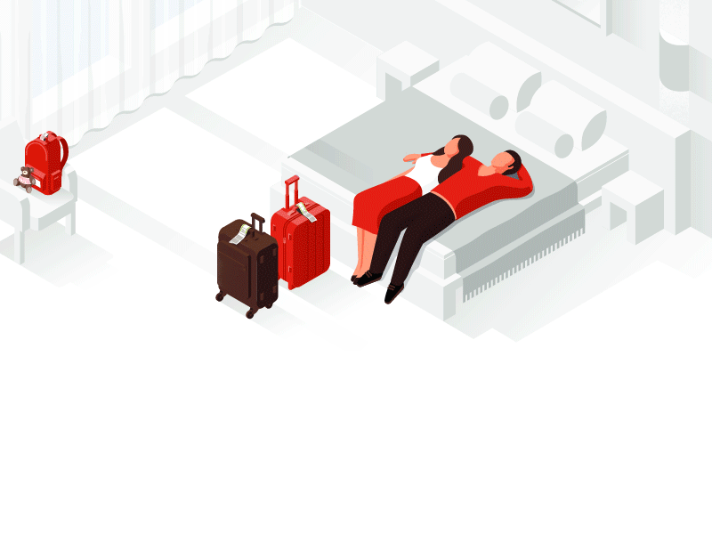
Google Hotels, by German Kopytov for Google.

One of the more popular styles that’s starting to catch on is isometric illustrations and renderings. And the folks that can add subtle animation to it are the champions.

Trend #3: Studio photography with solid backgrounds.

Portrait danny bowien 2500w

Photograph from Squarespace.

I’m really digging this style of photography, and I love how the background color matches the color of the model’s sweater. I think the other important thing to notice is that the model has a tattoo and a little swagger. He feels human–a person that you could approach and talk to. The last thing to note is the lighting seems like it’s coming from a single source, most likely a large lightbox/strobe. The entire photo is sharp, so they’re probably shooting with an 85mm at f8. The edges are crispy, and the exposure is perfect. I’m going to see if I can replicate this on my own… heh.

Aaaaaaaand, the people that add some subtle movement to it are going to be the champions.

Ps. if you want a little more inspiration, you should check out these other two sites:

Screen Shot 2018 02 09 at 10 46 37 PM

Makemepulse.com, Hat tip: James

Screen Shot 2018 02 09 at 10 46 58 PM

Zinus.com

Pss. After hanging out with these guys, I’m wondering if I should do a video series of designers talking about their tools, process, and potentially doing design reviews of new products. I wonder if other designers would geek out watching them pixel push their sketch files. Selfishly, I want to pick their brains and learn all their trade secrets! Hah!

Hearthstone Design Inspiration

For those of you who don’t know, Blizzard (the company that created Hearthstone, World of Warcraft, Heroes of the Storm, StarCraft, Diablo, Overwatch…) is like the Apple of game design. Their attention to detail is insanely meticulous. When someone says their product was built with love, Blizzard is the bar.

Hearthstone is filled with all sorts of Easter eggs, micro interactions and tiny little details. While most apps and games try to minimize long load times, Hearthstone celebrates it.

Hearthstone loading 2

Hearthstone’s match making load screen.

They could have slapped in a boring screen with a load bar, but they had some fun with it. I think there’s a lesson to be learned in these little details.

Recently, I saw a cool animation on Dribbble by Kyle Decker that was inspired by Hearthstone. To bring in these kinds of details to a product, a culture has to be built around going the extra mile. It’s pretty crazy that he was able to do this all with code.

Dat motion blurrrrrr tho.

As I work on Input, I’m trying to balance between building the essentials versus adding the special touches that add a wow factor. Here’s an example of a small animation tied to a micro-interaction when a user posts. Notice the tiny little animation in the button that resembles our logo. The animation prevents the user from double clicking and communicates that a post is being sent.

Button animation during posting.

I know these kinds of things won’t help us find product market fit… but there’s just something about exercising your love for details and the small things. I’m tickled by cool hover states, minimal transitions and micro-interactions. The best designs are often unnoticed… but on the other hand, I think there are times where users will welcome personality and a little extra somethin’ somethin’.

By the way, I made a Hearthstone video with my buddy Justin Ho. It’s a quick pilot to see if: a) it’s something that he’s interested in doing long term, and b) it’s something that I have time to edit. If you didn’t know, Justin (aka Lyrondak) was ranked #11 in the world last season. I actually believe he could be #1 in the world if he really tried.

The Greedy McGreeds original Hearthstone Deck.

This was our first attempt, so the audio and lighting is a little janky. Creating these videos is just a good excuse to fly drones and play crazy troll decks in Hearthstone.

Anyway, I’m not sure if this is something that we’re going to commit to yet… but I’m pretty determined to work on a video project at some point. I’m just waiting for the right opportunity. You’ll see some more experimental YouTube content soon.

Joining @Expa as Designer-in-Residence

Tw 3333451c

I’m excited to announce that I’ll be teaming up with Expa as Designer-in-Residence. I’m looking forward to working with the partners, awesome engineers and entrepreneurs to create new companies.

Expa was founded by Garrett Camp, co-founder of Uber and StumbleUpon, to apply his lessons learned creating successful startups. Joined by Hooman Radfar (founder of AddThis), Naveen Selvadurai (Foursquare co-founder), Milun Tesovic (founder of Metrolyrics), Roberto Sanabria (Google, Linkedin), Vítor Lourenço (Twitter designer, co-founder of Envoy) and 25 talented in-house experts in SF & NYC, the Expa team actively guides companies. We have done this before, founding 4 industry-defining startups that have collectively reached over 100 million registered users. And now we’re applying what we’ve learned to create the next generation of startups.

I’m thrilled to be joining efforts with this gang, and they’ve given me a warm welcome. I’d like to thank Annie, my family, my friends, and everyone following me for all their support over the last few days. I’ve read all your messages, and I hope that I’ve responded to everyone. Thank you! ^_^

Bunch 1.1

DSC_2703

Bunch beta was released a month ago, and since then we’ve made a couple of tweaks based on user feedback. Thanks to all our beta users for providing us insight, and kudos to the Bunch team for making the updates. If you haven’t tried it out yet, you can download it here.

I’m incredibly proud of the app, and I love using it with Annie, Vinny and my friends. The question is whether the app is useful and appealing to other people around the world.

The biggest bit of feedback we got when interviewing users is that they didn’t know how to message. We spent time improving the first time experience, hopefully to show users how messaging can be done easily by pressing and holding. This is the #1 issue we’re hoping to address in this update.

We’ve also made it so that you can add more than 8 people. For users that initially joined and had a ton of friends message them, this was a huge pain point. I know for a fact that I was having trouble messaging people that were outside my top 8.

Anyway, I’ll share more on lessons learned soon. Until then, try the app and let me know what you think. If you don’t have anyone to message, just add me as a friend. Search for “Jeff Wong”, and we can message each other. ^_^