addthis bling.


i had a few minutes of spare time yesterday to work on a small side project. in addition to the addthis swagger, i wanted to have a little fun and create some addthis bling. i actually learned a couple things by using this tutorial—i’ve never created my own custom patterns before. it’s really easy, and took about 15 minutes. i added a couple extra filters to give it a more realistic effect. i talked to one of my coworkers and they estimated that this bling would cost roughly $80k.


i also had the chance to create another shirt design… this is a really low res. i’ll probably go ahead and create the real tshirt this weekend. looks like alot more people in the office will order one.

you might also like:
new addthis swagger
official addthis spreadshirt store
addthis holiday logos

AddThis website refresh. Bigger and better.

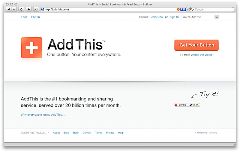
We’ve made some enhancements to AddThis.com. We’re moving really fast recently, so it’s been quick small steps in several directions. I feel like we’re covering alot of ground, so I’m extremely excited to see alot of our work go live. I just wanted to share some of the enhancements we’ve made in the last release.


800px wide to 960px wide. This means the analytics graphics and content will fill up your screen more. Larger graphs are nice. This also makes alot of the next gen design work much easier to implement since we have more real estate to work with.


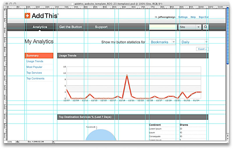
12 column grid system. Before we were using a 3 column grid system, which was easy to use since we didn’t have much content. With a 12 column grid system, we’re able to visually organize the content better. It also gives us more flexibility. I’ve been using gridr.atomeye.com alot recently. also check out this site to learn more about the web grid system. I’ll probably blog about it in more detail later.


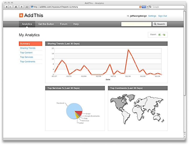
New simplified navigation. The navigation uses a more traditional nav bar, making it easier to scan the main menu items and manage your account. We’ve also added a search feature, making it easier for you to find information about any topic.


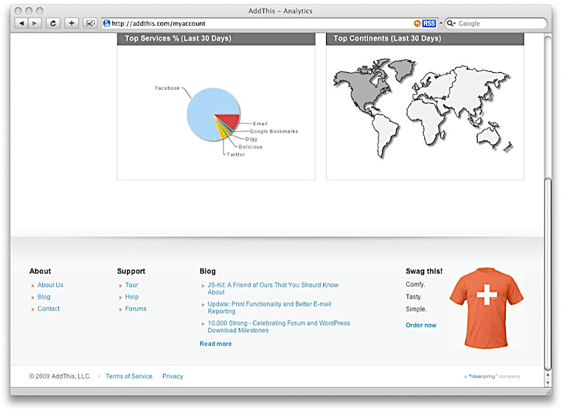
New footer. The new footer is pretty simple right now. It has quick links, blog snippits, and a promo spot. We’re redesigning the footer so that it’s a little more functional and blends in with the page a little better. I’m hoping to add a little twist of fun to it as well.


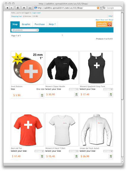
New swag store. You can now order your favorite AddThis gear. I wonder how many people will order a shirt. It’d be wonderful to see our brand grow and become embraced by the community like twitter.

Anyway, we have alot more stuff in the works. These are just a couple highlights of the design updates.

more addthis testing.

okay, i’m doing a little more testing. right now we’re thinking about replacing one of the icons on our menu. so it would be great if you could help identify:

a) which icons do you recognize
b) which button looks the best

1. delicious, digg, live bookmarks

2. facebook, digg, live bookmarks

3. facebook, delicious, live bookmarks

4. facebook, myspace, live bookmarks

5. facebook, digg, delicious

addthis menu testing.

i’m going to be doing some testing on our addthis sharing menu. before we actually go through with some of the tests, i’d like to get your opinion first:

a) which one is the prettiest and blends in with my webpage.
b) which one looks like you can click on it.
c) which one is easiest to read.

here are your choices. please help me by voting! just post a comment! ^__^

1. gray

2. google blue underline

3. google blue bold underline

4. blue

5. blue bold

addthis shirt update.

finally got my tshirt in from spreadshirt. the print came out really nice. i’m very happy with the digital print transfer. not sure what the status is on my track jacket. hopefully that should come in sometime soon (considering that it’s freezing outside). simple shirt. what do you think?

here’s my original post.