First Flat Tire in San Francisco

DSC_6975.jpg

Closeup of my first flat tire in San Francisco.

On my ride to work today, I heard a hissing sound and thought there was something rubbing against my tire. I pulled over and examined my wheel and noticed a giant piece of glass embedded into the rubber. As soon as I removed the glass, all the air came out of my tire.

DSC 6976

Philz Coffee on 24rd and Folsom St.

Fortunately, I was only a block away from my favorite coffee shop. So I locked up my bike and called up a pick-up service. Last year, I paid for a ($250) premium service from my bike shop (New Wheel), which is paying off now.

DSC 6977

The tow truck guy tying my bike down.

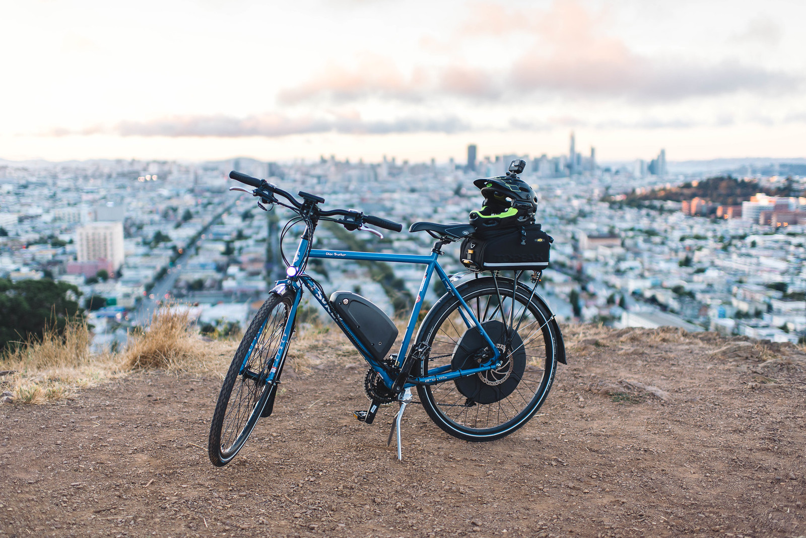
It sucks to pay for maintenance, but the reality is that I’m kind of lucky that I’ve gone so long without a flat. I’ve lasted a year and a half with 2300 miles on my e-bike. The only thing I’ve had to replace were my brakes in terms of wear and tear. And truth be told, I probably needed to replace my rear tire soon.

IMG 3856

I was running Schwalbe Marathon tires—and now I’ve upgraded to Marathon Plus. It’s advertised to have a little extra puncture resistance over the Marathon, in exchange for higher rolling resistance and costs a couple $$. Either way, I’m hoping that I won’t get another flat for a while.

One of my buddies said that I have had “really bad luck with this bike”…

But a flat tire isn’t that bad.

I remember getting flat tires every few months in Richmond, VA… and I didn’t ride as far back then.

On the other hand, San Francisco roads are full of pot holes, debris, broken glass, drug needles, etc. The fact that I’ve gone this far without getting a flat kind of boggles my mind.

Anyway, all is back to normal. I’m kind of glad I got the comprehensive membership. I highly recommend it to anyone if you’re in the market.

The Difference of a Few Pixels at Facebook

1 wVbXLamvms92BPrapEBigw

Comments refinements on Facebook before (L) and after (R).

Vitor shared an article with me recently about how FB did a ton of testing and research to arrive at their latest design iteration. It’s pretty amazing how dozens of small refinements working together can make a huge difference.

Small changes, like a few extra pixels of padding or the tint of a button, can have large and unexpected repercussions.

On a side note, it looks like Facebook has integrated a ton of design cues from Instagram—rounded corners, chat-like comment bubbles, outlined icons, and overall a lighter interface.

Inspired by Facebook

I’m currently working on a comments feature as well on my project and I’m going to borrow some design cues from our friends at FB.

New

Revised version of comments, following a similar style as FB

I think that the icon shape, bubbles, and avatar sizes creates a better visual hierarchy. I’m pretty sure I’m going to change it again in the future, but this looks like a nice improvement. Anyway, we have some good stuff coming soon. Really looking forward to shipping this new design.

Evolving the Facebook News Feed to Serve You Better
Hat tip: Vitor

Beautiful Pills by Takecareof.com

Screen Shot 2018 02 13 at 10 04 18 PM

Takecareof.com (Hat tip: Erin)

I’m really digging this site. The photography, the typeface, product packaging and the aesthetics are 👌. The product itself seems pretty cool—personalized vitamins. It even says “Hi [your name]” to give it that personal touch.

Typeface

Let’s start with the font… I really like the combination of bold san serif for the headers, and serif for the body. The combination of short punchy headlines make it feel kind of handmade and human.

DLR GRP 2359

Ginger

It kind of reminds me of a modern day Futura, but more refined.

125733

Gauthier

Love this font as well. I’d could imagine using this for a print project… something with debossed type on a nice thick stock. It just has such a tactile feel to it.

Photography

I have nothing but good things to say about the photography. I absolutely love the pictures of ingredients on a solid color background. The neutral pastel colors combined with the strong accent colors of the ingredients are absolutely tasty.

Img prenatal hero

Img turmeric hero

Img vitaminc hero

And when you combine type on top of these images, it just looks 🤘. I’m guessing that they did a bunch of photo composites… but it looks good.

White Space

And their use of white space is pretty boss. It’s like a breath of fresh air when you scroll through their site.

Screenshot

Anyway, I thought this was a good one to bookmark. They made a bunch of pills sexy, approachable and human. 💊

Takecareof.com

Testing Slow Motion Video Between DSLR and iPhone

D600

A still frame of James on the D600.

I’m not sure what compelled me to do this today, but I wanted to do a quick comparison between my iPhone 7+ and my Nikon D600 to see which one did slow motion better.

Iphone

Same shot, but from a different angle on the iPhone 7+.

While my Nikon was outfitted with a 35mm f1.4, I had to shoot at 720p in order to get 60fps. While I lost a lot of resolution, it doesn’t look terrible. On the other hand, the iPhone boasts awesome slow motion performance, but the feeling isn’t as cinematic.

James showing off his Vape Nation skills in slow motion video.

Now I’m really curious to see what it’ll look like show with my 58mm. In addition, I think it would be cool to try doing a portrait photo with a light pattern casted from some window blinds… or maybe even play with a prism to get a cool rainbow effect running through the smoke.

More importantly, I’m thinking about using this kind of stuff for b-roll when I make a real video in the future. Anyway, enjoy!

Hanging Out With SF Designers

IMG 3833

James Donovan and #squad doing a design review during lunch.

I spent the majority of this afternoon hanging out with some other designers in SF. The caliber of talent here is amazing. I had a great time doing a design review and talking about trends, philosophy, and our current challenges as designers.

It was refreshing and these guys lifted my spirit. They were passionate about design… and they really cared about the details. They’re also specialized at what they do–like a surgeons knife–illustrators, systems design, visual design, interaction, etc. It’s fascinating to see how deep their expertise goes in each discipline.

It’s been a while since I’ve had a chance to do a design review with other creatives. A lot of times I’ll get feedback from people, but you really have to un-package what they’re trying to say. I enjoy the challenge, but working with folks in the creative field gives you a chance to talk in the same language. Sometimes it’s nice to talk about pixels. It was a breath of fresh air and it makes me want to step up my game when I hang around these guys.

So let’s recap some of the trends we talked about in our design review…

Trend #1: Circular Font

Circularintro

Circular is the new Helvetica.

As far a design trends go, we felt like certain fonts like Circular have been pretty much adopted by everyone. AirBnb was one of the first to really make this font mainstream, but it’s pretty much everywhere now. Even Atlassian is using it–check out their graphic standards manual. Eeeeeeveryone is on the circular train. But my god, it looks so good.

Trend #2: Flat Illustrations

72987bf6946786f2879ee44fd42b05f2

A flat illustration from Slack’s website.

Again, it seems that this trend has been going strong for a while, and we’re starting to see everyone adopt it. Not to pick on Atlassian again, but they are also using this exact style in their illustrations. Even Uber uses a variation of it if you scroll down parts of their site. Same goes with Evernote, and our friends at Shift.org. It’s hot right now.

Google Hotels, by German Kopytov for Google.

One of the more popular styles that’s starting to catch on is isometric illustrations and renderings. And the folks that can add subtle animation to it are the champions.

Trend #3: Studio photography with solid backgrounds.

Portrait danny bowien 2500w

Photograph from Squarespace.

I’m really digging this style of photography, and I love how the background color matches the color of the model’s sweater. I think the other important thing to notice is that the model has a tattoo and a little swagger. He feels human–a person that you could approach and talk to. The last thing to note is the lighting seems like it’s coming from a single source, most likely a large lightbox/strobe. The entire photo is sharp, so they’re probably shooting with an 85mm at f8. The edges are crispy, and the exposure is perfect. I’m going to see if I can replicate this on my own… heh.

Aaaaaaaand, the people that add some subtle movement to it are going to be the champions.

Ps. if you want a little more inspiration, you should check out these other two sites:

Screen Shot 2018 02 09 at 10 46 37 PM

Makemepulse.com, Hat tip: James

Screen Shot 2018 02 09 at 10 46 58 PM

Zinus.com

Pss. After hanging out with these guys, I’m wondering if I should do a video series of designers talking about their tools, process, and potentially doing design reviews of new products. I wonder if other designers would geek out watching them pixel push their sketch files. Selfishly, I want to pick their brains and learn all their trade secrets! Hah!

~1 Year Since My Bike Accident

Photos of my bike with an updated Surly touring frame.

I can’t believe it’s been about a year since my bike accident last year. For those of you who don’t know, around this time last year, I got in a nasty bike accident last year which left me with stitches, a concussion, two chipped teeth, and a damaged bike. It was pretty rough because it overlapped the time when I was shutting down Flare and transitioning to a new project. Thankfully, I had insurance and a strong support network here to help me out.

I made a fast recovery… and when I was able to ride again, I made a video that documented my crash as well as an issue I had with my bike. This all happened last year, but I’m finally getting around to sharing this video one year later.

One of my first vlogs on youtube I created last year.

Anyway, everything is okay now. Since then, I get my bike serviced once a month to make sure all the parts are in working order. I also got a full face helmet along with a GoPro to document my daily commute.

By the way, since last year, New Wheel (the company that sold me my e-bike), replaced my damaged frame free of charge. I had to twist their arm, but they stood by their product and rebuilt my bike after the rear wheel dislodging. So, if you’re in the market to get an electric bike in San Francisco, I’d recommend them.

So, I ride super conservatively now and I avoid questionable conditions.

HOWEVER, Google Maps managed to navigate me through a really sketchy path. I would say this felt as sketchy as walking around in the Tenderloin at night. I really wish there was a checkbox on Google Maps that says, “Avoid Sketch AF Routes”. Since I’m sharing some crazy videos, here’s another one…

Sketch AF bike route by Google Maps.

#neveragain

While I love San Francisco, there are times that I’d like to get away from the craziness. I live in Bernal Heights now, and it’s pretty safe/clean… but all you have to do is walk a couple streets down the hill, and it gets seedy.

Okay to lighten things up, here’s one more video of another bike ride. This is a time lapse of a bike ride I did with Patrick from Sausalito back to Bernal Heights.

Timelapse video of a 56 mile bike ride from Sausalito to Bernal Heights.

Hopefully you won’t get too dizzy watching it. It kind of starts smoothing out once we go over the Golden Gate bridge. Next time I’ll see if I can run these kinds of videos through a hyper lapse filter to remove all the jittering. Enjoy!